Что такое кривая Лоренца, коэффициент Джини (индекс Джини) и как их рисовать и считать?
Начнем с кривой Лоренца.
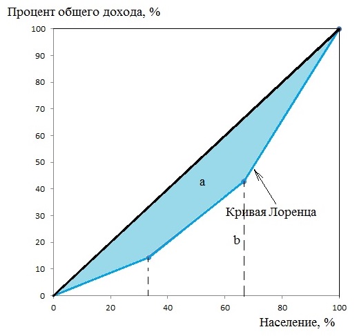
Кривая Лоренца
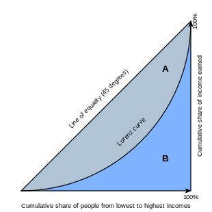
Кривая Лоренца — это график, демонстрирующий степень неравенства в распределении дохода или богатства в обществе. Ее придумал в 1905 году американский статистик Макс Лоренц.
Собственно говоря, эта кривая может отражать неравенство в распределении самых разных величин, но вначале она предназначалась именно для отражения экономического неравенства в обществе.
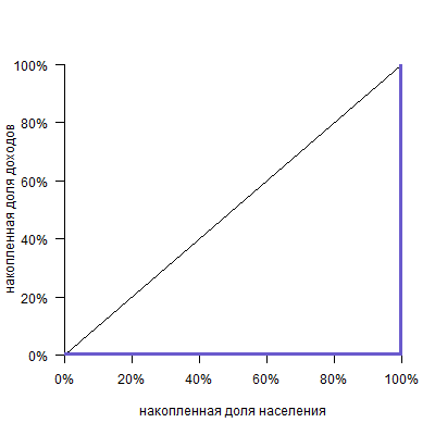
Кривая выглядит следующим образом:
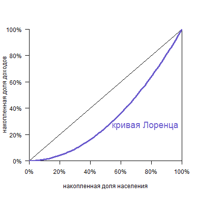
По горизонтальной оси указана накопленная доля населения (причем население отсортировано от беднейших, то есть получающих наименьший доход, до богатейших), а по вертикальной — доля получаемого дохода.
Это лучше понять на примере:
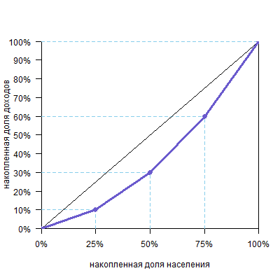
Предположим, мы разбили все население страны на 4 группы, в каждой из которых по 25% населения. При этом первая, «бедная» группа получает 10% общего дохода страны, вторая, «ниже среднего» — 20%, третья, «выше среднего» — 30% и четвертая, «богатая» — 40%.
| Группа | Доля населения | Доля от общего дохода |
| бедная | 25% | 10% |
| ниже среднего | 25% | 20% |
| выше среднего | 25% | 30% |
| богатая | 25% | 40% |
Теперь переведем это в накопленные доли: 25% населения будут получать 10%, 50% населения (это «бедная» и «ниже среднего» группы) суммарно получают 10%+20%=30%, 75% населения («бедная», «ниже среднего» и «выше среднего» группы) получат 10%+20%+30%=60% всего дохода, и, разумеется, 100% населения получат 100% дохода.
| Накопленная доля населения | Накопленная доля общего дохода |
| 25% | 10% |
| 50% | 30% |
| 75% | 60% |
| 100% | 100% |
Теперь можно построить график.
Обратите внимание, что кривая всегда исходит из точки (0%;0%) и приходит в точку (100%;100%), так как ясно, что 0% населения получают 0% дохода, а 100% населения получают 100% дохода.
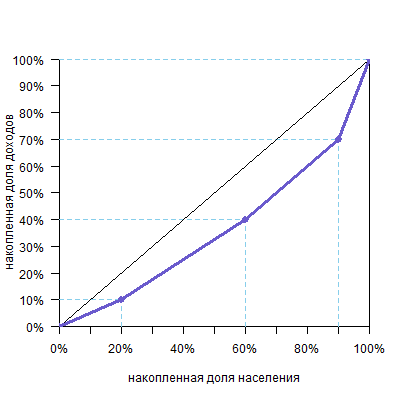
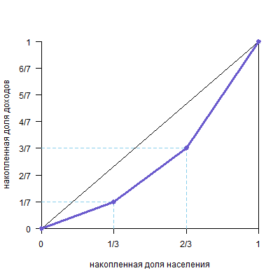
Необязательно, чтобы группы были равными. Например, возьмем такие данные:
| Доля населения | Доля от общего дохода | Накопленная доля населения | Накопленная доля общего дохода |
| 20% | 10% | 20% | 10% |
| 40% | 30% | 60% | 40% |
| 30% | 30% | 90% | 70% |
| 10% | 30% | 100% | 100% |
Обратите внимание, что группы нужно распределить от бедных к богатым. Если группы одинаковые, то они сортируются просто по столбцу «Доля от общего дохода» — от маленьких значений к большим (см. прошлый пример). Но у нас группы разного размера, поэтому нужно учитывать отношение второго столбца к первому (доли дохода к доле населения). Например, у нас вторая и третья группы получают одинаковую долю дохода. Но во второй группе населения больше, а значит, в расчете на одного человека они беднее. То же с третьей и четвертой группой. Вообще говоря, случай с разными группами редкий и встречается только в условных задачах. Но если будут такие условия, то нужно делить долю дохода на долю населения. Для наших групп получим:
10%/20%=1/2
30%/40%=3/4
30%/30%=1
30%/10%=3
Это значит, что в третьей группе население получает именно средний по стране доход на человека. В первой группе доход в два раза ниже среднего, во второй — 75% от среднего, а в четвертой — три средних дохода на человека. Вот в таком порядке их и нужно расположить для построения кривой Лоренца.
Получим такой график:
И, конечно, количество групп может быть любым. Желательно, чтобы их было побольше, тогда кривая будет построена по большему числу точек, станет более гладкой и точной.
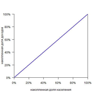
Можно представить себе кривую абсолютно равного распределения: это будет просто диагональ, так как любые N% населения получают N% дохода:
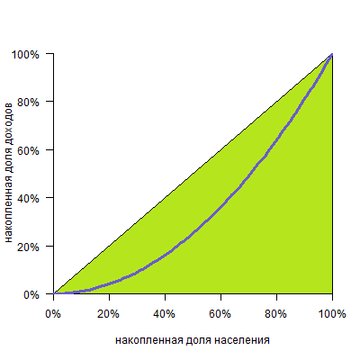
И кривую абсолютного неравенства, когда все работают бесплатно, а один-единственный человек получает весь доход:
(Не думайте, что это совершенно умозрительная кривая: например, если у единственного человека в стране есть, скажем, говорящий еж, то кривая распределения говорящих ежей будет именно такой!)
А теперь:
Коэффициент Джини
К 1912 году итальянский статистик Коррадо Джини разработал алгебраическую интерпретацию кривой Лоренца: коэффициент, призванный указывать, насколько неравным является экономическое распределение.
Все очень просто. Коэффициент этот равен отношению площади фигуры между диагональю и кривой Лоренца:
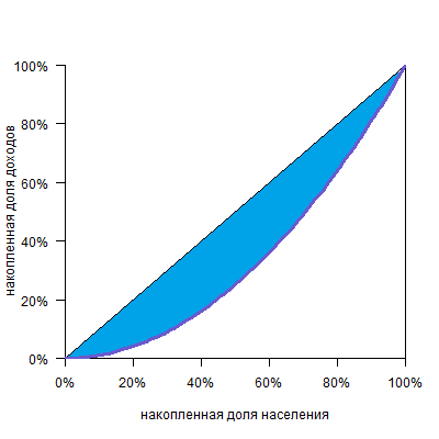
К площади треугольника под диагональю (а она всегда равна 0,5):
Таким образом, при полном равенстве площадь первой фигуры равна нулю, и коэффициент тоже равен нулю. При полном неравенстве эта фигура займет весь треугольник и коэффициент будет равен единице.
Чем ниже коэффициент, тем более равным является распределение.
Как его считать?
Считать коэффициент Джини можно графическим или алгебраическим способом. Посмотрим, как это можно сделать.
Графический способ
Вертикальными линиями можно разделить фигуру над кривой Лоренца на два треугольника и несколько трапеций.
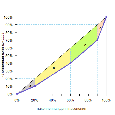
Площадь треугольника — половина основания на высоту, а трапеции — полусумма оснований на высоту (поверните голову на 90º, высоты расположены горизонтально, а основания — вертикально). Высоты равны размерам групп, а основания легко посчитать. В нашем случае площадь фигуры будет такой:
| фигура | расчет площади | площадь |
| треугольник a | 10%*20%/2=0,1*0,2/2 | 0,01 |
| трапеция b | (10%+20%)/2*40%=0,3/2*0,4 | 0,06 |
| трапеция c | (20%+20%)/2*30%=0,4/2*0,3 | 0,06 |
| треугольник d | 20%*10%/2=0,2*0,1/2 | 0,01 |
| Всего площадь фигуры (a+b+c+d) | 0,14 |
Теперь разделим ее на площадь треугольника под диагональю (а он, напоминаю, всегда равен 0,5) и получим: 0,14/0,5=0,28
Таким образом, 0,28 или 28% и есть значение коэффициента Джини.
Другой графический способ: посчитать площадь фигур под кривой Лоренца, а затем вычесть их из площади треугольника под диагональю (0,5) и получить площадь над кривой. И ее уже разделить на 0,5.
Этот случай удобнее, когда цифры не такие круглые и ширина оснований трапеций над кривой неочевидна.
В нашем случае
| фигура | расчет площади | площадь |
| треугольник a | 10%*20%/2=0,1*0,2/2 | 0,01 |
| трапеция b | (10%+40%)/2*40%=0,5/2*0,4 | 0,1 |
| трапеция c | (40%+70%)/2*30%=1,1/2*0,3 | 0,165 |
| трапеция d | (70%+100)%/2*10%=1,7/2*0,1 | 0,085 |
| Всего площадь фигуры (a+b+c+d) | 0,36 |
Отнимаем 0,36 от 0,5 и получаем 0,14 — площадь фигуры над кривой
Далее, как и в первом способе, делим эту площадь на 0,5 (площадь треугольника под диагональю) и получаем: 0,14/0,5=0,28
Алгебраический способ
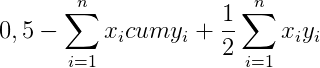
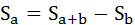
Наиболее проста в употреблении формула:[latexpage]
где:
$x{_{i}}$-доля i-ой группы в составе населения
$y{_{i}}$-доля i-ой группы в объеме доходов
$cum y{_{i}}$-кумулированная (накопленная) доля i-ой группы в составе населения
Составим таблицу на основе данных предыдущего примера:
| Доля населения ($x{_{i}}$) |
Доля от общего дохода ($y{_{i}}$) |
Накопленная доля общего дохода ($cum y{_{i}}$) |
$x{_{i}}y{_{i}}$ | $x{_{i}}cum y{_{i}}$ |
| 20% | 10% | 10% | 0,02 | 0,02 |
| 40% | 30% | 40% | 0,12 | 0,16 |
| 30% | 30% | 70% | 0,09 | 0,21 |
| 10% | 30% | 100% | 0,03 | 0,1 |
| Итого | 0,26 | 0,49 |
Если вы не понимаете, как построена эта таблица, откройте спойлер:
Первый и второй столбцы — это исходные данные, они такие же, как и в разделе «Графический способ».
Третий столбец получается из второго путем накопления значений из второго столбца: берем значение из ячейки слева и всех ячеек выше нее и складываем.
Четвертый столбец — произведение первого и второго.Чтобы не запутаться в процентах, переведите их в доли, например для первой строки: 20%10%=0,20,1=0,02.
Пятый столбец — произведение первого и третьего.
Далее подсчитываем суммы по четвертому и пятому столбцу.
Теперь можно подставить полученные суммы в формулу, которая приведена выше:
$G=1-2*0,49+0,26=1-0,98+0,26=0,28$
Мы получили ответ 0,28 — такой же, как и графическим методом.
Это самая простая в применении формула. Советую ее запомнить. А если вдруг хочется понять, как она выведена, откройте этот спойлер (объяснение довольно длинное!):
В основе этой формулы лежит уже известная вам идея: чтобы посчитать площадь фигуры над кривой Лоренца:
можно сперва посчитать площадь фигуры под кривой Лоренца

а потом вычесть ее из площади диагонального треугольника, которая равна 0,5, и получим искомое. Саму же площадь под кривой будем считать по группам. Можно видеть, что над каждой группой образуется треугольник или четырехугольник — они выделены разными цветами.
Рассмотрим, например, вторую группу (зеленый четырехугольник).

Площадь четырехугольника ABDE равна площади прямоугольника ACDE минус площадь прямоугольного треугольника BCD. При этом площадь прямоугольника ACDE равна AEDE, а площадь прямоугольного треугольника BCD равна CDBC/2. Таким образом, площадь ABDE равна
AEDE-CDBC/2
При этом можно увидеть на графике, что ВС — доля дохода по группе (y), DE — накопленная доля дохода по группе (cum y), а AE или CD — доля группы в численности населения (x). Тогда формула принимает вид
хcum y — xy/2
Можно видеть, что такая формула (прямоугольник минус прямоугольный треугольник) пригодна для всех цветных фигур, включая и левый розовый треугольник.
Тогда сумма всех фигур под кривой Лоренца будет равна
Эту сумму, как вы помните, нужно вычесть из 0,5, чтобы получить площадь фигуры над кривой
И наконец, разделив все это на площадь диагонального треугольника (то есть опять же на 0,5), получим формулу коэффициента Джини:
Есть и другие формулы, расчет по одной из них приведен, например, вот тут. Мне кажется, что в ней проще запутаться, а получается ровно то же самое.
Чтобы проверить себя, решите задачу. Ответ и решение под спойлерами:
Задача
Предположим, что в некоторой стране N проживают три группы населения: бедные, средний класс и богатые. Группы равны по численности жителей, но различаются по уровню дохода: средний класс зарабатывает в два раза больше, чем бедные, а богатые зарабатывают в два раза больше, чем средний класс. Внутри групп доходы распределены равномерно. Нарисуйте график кривой Лоренца и рассчитайте коэффициент Джини.
G≈0,286
Удобней считать площадь под кривой, так как цифры в натуральных дробях.
Площадь треугольника a равна (1/7*1/3)/2=1/42
Площадь трапеции b равна (1/7+3/7)/21/3=2/71/3=2/21
Площадь трапеции c равна (3/7+1)/21/3=5/71/3=5/21
Общая сумма фигур 1/42+2/21+10/21=1/42+4/42+10/42=15/42
Чтобы получить фигуру над кривой Лоренца, нужно эту сумму вычесть из 0,5
0,5-15/42=21/42-15/42=6/42=3/21
Для того, чтобы получить значение коэффициента Джини, делим это число на 0,5
3/21 / 0,5 = 6/21 ≈0,286
Поскольку средний класс зарабатывает в два раза больше, чем бедные, а богатые — в два раза больше среднего класса, то всего они зарабатывают семь долей бедного класса, то есть, соответственно, 1/7, 2/7 и 4/7, что примерно равно 0,143, 0,286 и 0,571
| Доля населения(x) | Доля от общего дохода (y) |
Накопленная доля общего дохода (cum y) |
x*y | x*cum y |
| 0,333 | 0,143 | 0,143 | 0,048 | 0,048 |
| 0,333 | 0,286 | 0,429 | 0,095 | 0,143 |
| 0,333 | 0,571 | 1,000 | 0,190 | 0,333 |
| Итого: | 0,333 | 0,524 |
G=1-2*0,524+0.333≈0,286
Экономика07 марта 2019 в 08:00126 885
Коэффициент Джини: все ли равны?
Разбираемся с показателем экономического неравенства
Индекс неравенства
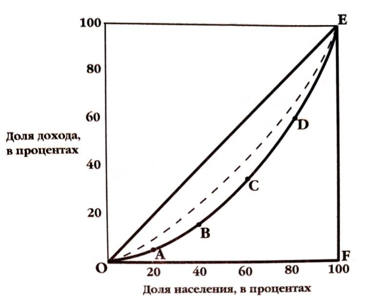
Рис 1. Кривая Лоренца
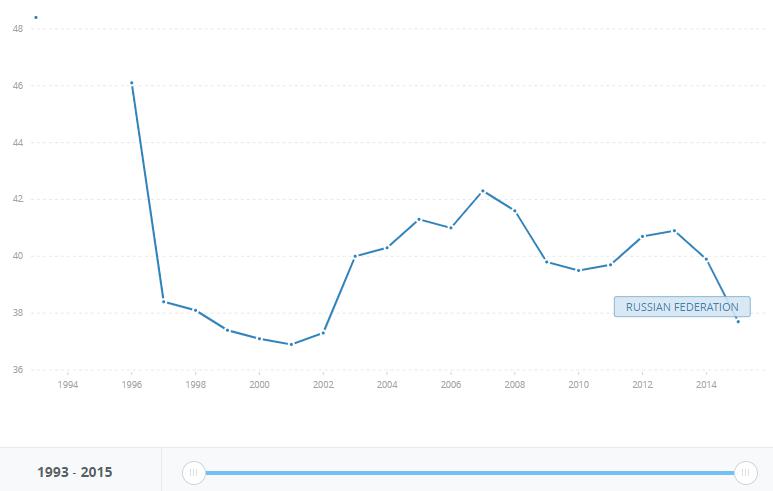
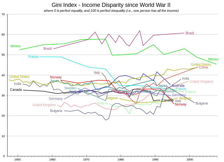
Рис. 2. Динамика коэффициента Джини, 1996-2015 года. Источник: https://data.worldbank.org/indicator/SI.POV.GINI?end=2015&locations=RU&start=1993&view=chart
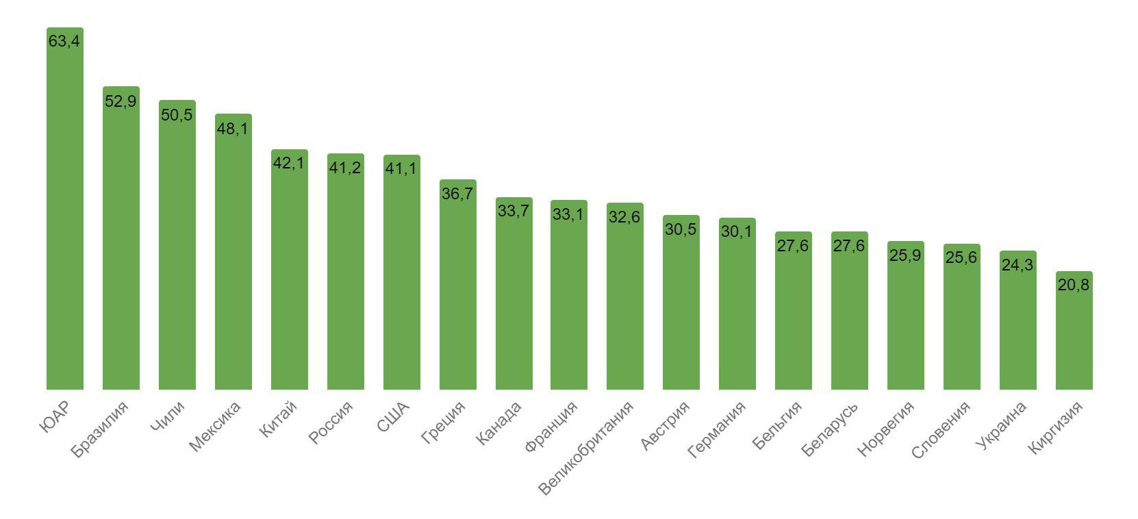
Рис. 3. Индекс Джини в странах мира (данные на 2016 год).
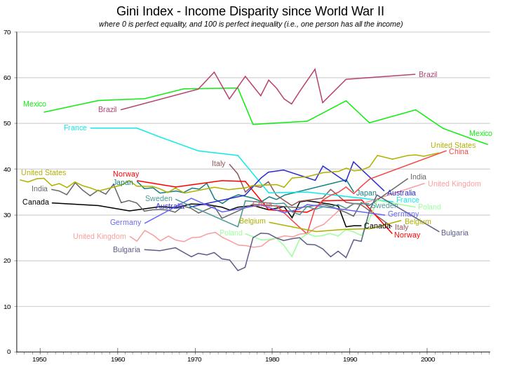
Рис. 4. Динамика индекса Джини. Источник: https://www.people.iup.edu/rhoch/ClassPages/Global_Cities/Spring17/Notes/RGPL103_ForExam1.pdf
Богатство и бедность
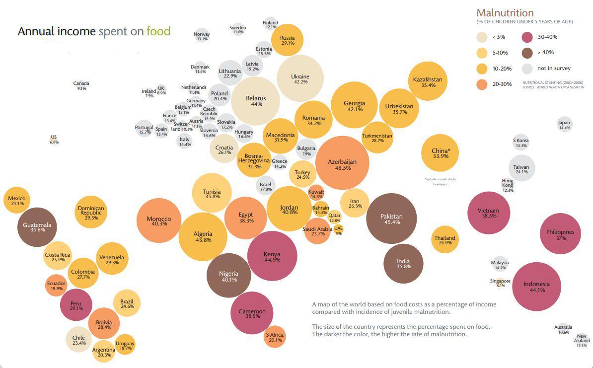
Рис. 5. Доля трат на продукты по странам мира. Источник: http://wsm.wsu.edu/researcher/WSMaug11_billions.pdf
Могу ли я изменить личную ситуацию?
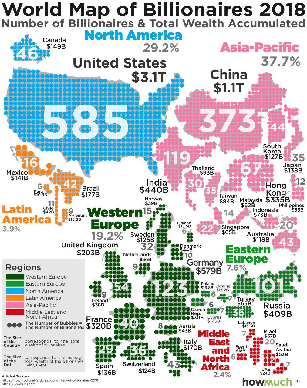
Рис. 6. Количество миллиардеров по странам мира. Источник: https://howmuch.net/articles/world-map-of-billionaires-2018
Подведем итоги
Больше интересных материалов
Предположим, что в некоторой стране N проживают три группы населения: бедные, средний класс и богатые. Группы равны по численности жителей, но различаются по уровню дохода: средний класс зарабатывает в два раза больше, чем бедные, а богатые зарабатывают в два раза больше, чем средний класс. Внутри групп доходы распределены равномерно. Совокупный доход всех жителей страны равен Y. Нарисуйте график кривой Лоренца и рассчитайте индекс Джини.
Решение:
Третья часть населения, по условию задачи, бедные. Их доходы обозначим через х.
Тогда 2х – величина доходов среднего класса,
4х — величина доходов богатых.
Следовательно, совокупный доход всех жителей страны Y состоит из 7 одинаковых частей.
1/7 – доля доходов бедных,
2/7 – доля доходов среднего класса,
4/7 – доля доходов богатых.
Представим условие задачи в табличной форме:
| Социальная группа населения | Доля населения, xi | Доля в общем объёме денежных доходов, уi | Расчётные величины | ||
|---|---|---|---|---|---|
| Кумулятивная доля дохода, cum yi | xi cum yi | xi уi | |||
| Бедные | 0,333 | 0,1429 | 0,1429 | 0,0475724 | 0,0475724 |
| Средний класс |
0,333 | 0,2857 | 0,4286 | 0,1427138 | 0,0951414 |
| Богатые | 0,333 | 0,5714 | 1,0000 | 0,333 | 0,1902862 |
| Итого | 1,000 | 1,0000 | — | 0,5232862 | 0,333 |
Построим кривую Лоренца:
Индекс Джини рассчитаем двумя способами.
1) Способ аналитический. Коэффициент Джини рассчитывается по формуле:
где
xi – доля населения, принадлежащая к i-й социальной группе в общей численности населения;
уi – доля доходов, сосредоточенная у i-й социальной группы населения;
n – число социальных групп;
cum yi – кумулятивная доля дохода.

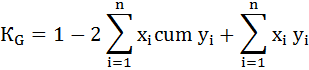
2) Способ геометрический. Коэффициент Джини определяется как отношение площади фигуры, образуемой кривой Лоренца и линией равномерного распределения (Sa), к площади треугольника ниже линии равномерного распределения (Sa+b):

Площадь фигуры, образуемой кривой Лоренца и линией равномерного распределения (Sa) легко найти вычитанием из площади треугольника (Sa+b) площадь фигуры, лежащей ниже кривой Лоренца.
Площадь фигуры b, лежащей ниже кривой Лоренца можно разбить на треугольник и две трапеции:


Площадь фигуры a будет равна:

Индекс Джини будет равен:
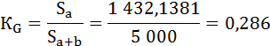
Оба способа дали одинаковый результат.
Как видно из таблицы, наиболее обеспеченная группа населения сконцентрировала 57,14% доходов, а доля наименее обеспеченной группы в общем доходе составила 14,29%.

Map of income inequality Gini coefficients by country (%). Based on World Bank data ranging from 1992 to 2020.[1]
-
Above 50
-
Between 45 and 50
-
Between 40 and 45
-
Between 35 and 40
-
Between 30 and 35
-
Below 30
-
No data

A different map showing wealth Gini coefficients within countries for 2019[2]

Share of income of the top 1% for selected developed countries, 1975 to 2015
In economics, the Gini coefficient ( JEE-nee), also known as the Gini index or Gini ratio, is a measure of statistical dispersion intended to represent the income inequality, the wealth inequality, or the consumption inequality[3] within a nation or a social group. It was developed by statistician and sociologist Corrado Gini.
The Gini coefficient measures the inequality among the values of a frequency distribution, such as levels of income. A Gini coefficient of 0 reflects perfect equality, where all income or wealth values are the same, while a Gini coefficient of 1 (or 100%) reflects maximal inequality among values. For example, if everyone has the same income, the Gini coefficient will be 0. In contrast, a Gini coefficient of 1 indicates that within a group of people, a single individual has all the income, wealth, or consumption, while all others have none.[4][5]
The Gini coefficient was proposed by Corrado Gini as a measure of inequality of income or wealth.[6] For OECD countries in the late 20th century, considering the effect of taxes and transfer payments, the income Gini coefficient ranged between 0.24 and 0.49, with Slovenia being the lowest and Mexico the highest.[7] African countries had the highest pre-tax Gini coefficients in 2008–2009, with South Africa having the world’s highest, estimated to be 0.63 to 0.7.[8][9] However, this figure does drop to 0.52 after social assistance is taken into account, and drops again to 0.47 after taxation.[10] The country with the lowest Gini coefficient is Slovenia, with 0.232. [11]The global income Gini coefficient in 2005 has been estimated to be between 0.61 and 0.68 by various sources.[12][13]
There are some issues in interpreting a Gini coefficient as the same value may result from many different distribution curves. To mitigate this, the demographic structure should be taken into account. Countries with an aging population or with an increased birth rate experience an increasing pre-tax Gini coefficient even if real income distribution for working adults remains constant. Scholars have devised over a dozen variants of the Gini coefficient.[14][15][16]
History[edit]
The Gini coefficient was developed by the Italian statistician Corrado Gini and published in his 1912 paper Variabilità e mutabilità (Italian: variability and mutability).[17][18] Building on the work of American economist Max Lorenz, Gini proposed that the difference between the hypothetical straight line depicting perfect equality, and the actual line depicting people’s incomes, be used as a measure of inequality.[19]
Definition[edit]
Graphical representation of the Gini coefficient:
The graph shows that the Gini coefficient is equal to the area marked A divided by the sum of the areas marked A and B, that is, Gini = A/(A + B). It is also equal to 2A and to 1 − 2B due to the fact that A + B = 0.5 (since the axes scale from 0 to 1).
The Gini coefficient is an index for the degree of inequality in the distribution of income/wealth, used to estimate how far a country’s wealth or income distribution deviates from an equal distribution.[20]
The Gini coefficient is usually defined mathematically based on the Lorenz curve, which plots the proportion of the total income of the population (y-axis) that is cumulatively earned by the bottom x of the population (see diagram). [21]The line at 45 degrees thus represents perfect equality of incomes. The Gini coefficient can then be thought of as the ratio of the area that lies between the line of equality and the Lorenz curve (marked A in the diagram) over the total area under the line of equality (marked A and B in the diagram); i.e., G = A/(A + B). If there are no negative incomes, it is also equal to 2A and 1 − 2B due to the fact that A + B = 0.5.[22]
Suppose all people have non-negative income (or wealth, as the case may be). In that case, the Gini coefficient can theoretically range from 0 (complete equality) to 1 (complete inequality) and is sometimes expressed as a percentage ranging between 0 and 100. If negative values are possible (such as the wealth of people with debts), then the Gini coefficient could theoretically be more than 1. Usually, the mean (or total) is assumed to be positive, which rules out a Gini coefficient of less than zero.[23]
An alternative approach is to define the Gini coefficient as half of the relative mean absolute difference, which is equivalent to the definition based on the Lorenz curve.[24] The mean absolute difference is the average absolute difference of all pairs of items of the population, and the relative mean absolute difference is the mean absolute difference divided by the average,  , to normalize for scale. If xi is the wealth or income of person i, and there are n persons, then the Gini coefficient G is given by:

When the income (or wealth) distribution is given as a continuous probability density function p(x), the Gini coefficient is again half of the relative mean absolute difference:

where  is the mean of the distribution, and the lower limits of integration may be replaced by zero when all incomes are positive.[25]
Calculation[edit]

Richest u of population (red) equally share f of all income or wealth; others (green) equally share remainder: G = f − u. A smooth distribution (blue) with the same u and f always has G > f − u.


While the income distribution of any particular country will not correspond perfectly to the theoretical models, these models can provide a qualitative explanation of the income distribution in a nation given the Gini coefficient.
Example: Two levels of income[edit]
The extreme cases are represented by the «most equal» society in which every person receives the same income (G = 0) and the «most unequal» society (composed of N individuals) where a single person receives 100% of the total income and the remaining N − 1 people receive none (G = 1 − 1/N).
A simplified case distinguishes just two levels of income, low and high. If the high income group is a proportion u of the population and earns a proportion f of all income, then the Gini coefficient is f − u. A more graded distribution with these same values u and f will always have a higher Gini coefficient than f − u.
An example case in which the wealthiest 20% of the population has 80% of all income (see Pareto principle) would lead to an income Gini coefficient of at least 60%.
Another example case,[26] in which 1% of the world’s population owns 50% of all wealth, would result in a wealth Gini coefficient of at least 49%.
Alternative expressions[edit]
In some cases, this equation can be applied to calculate the Gini coefficient without direct reference to the Lorenz curve. For example, (taking y to indicate the income or wealth of a person or household):
- For a population uniform on the values yi, i = 1 to n, indexed in non-decreasing order (yi ≤ yi+1):
-
- This may be simplified to:
- This formula actually applies to any real population, since each person can be assigned their own yi.[27]


Since the Gini coefficient is half the relative mean absolute difference, it can also be calculated using formulas for the relative mean absolute difference. For a random sample S consisting of values yi, i = 1 to n, that are indexed in non-decreasing order (yi ≤ yi+1), the statistic:

is a consistent estimator of the population Gini coefficient, but is not, in general, unbiased. Like G, G(S) has a simpler form:

There does not exist a sample statistic that is, in general, an unbiased estimator of the population Gini coefficient, like the relative mean absolute difference.
Discrete probability distribution[edit]
For a discrete probability distribution with probability mass function 
 , where
  is the fraction of the population with income or wealth
  , the Gini coefficient is:

where

If the points with non-zero probabilities are indexed in increasing order  , then:

where
 and These formulas are also applicable in the limit, as


Continuous probability distribution[edit]
When the population is large, the income distribution may be represented by a continuous probability density function f(x) where f(x) dx is the fraction of the population with wealth or income in the interval dx about x. If F(x) is the cumulative distribution function for f(x):

and L(x) is the Lorenz function:

then the Lorenz curve L(F) may then be represented as a function parametric in L(x) and F(x) and the value of B can be found by integration:

The Gini coefficient can also be calculated directly from the cumulative distribution function of the distribution F(y). Defining μ as the mean of the distribution, and specifying that F(y) is zero for all negative values, the Gini coefficient is given by:

The latter result comes from integration by parts. (Note that this formula can be applied when there are negative values if the integration is taken from minus infinity to plus infinity.)
The Gini coefficient may be expressed in terms of the quantile function Q(F) (inverse of the cumulative distribution function: Q(F(x)) = x)

Since the Gini coefficient is independent of scale, if the distribution function can be expressed in the form f(x,φ,a,b,c…) where φ is a scale factor and a,b,c… are dimensionless parameters, then the Gini coefficient will be a function only of a,b,c….[28] For example, for the exponential distribution, which is a function of only x and a scale parameter, the Gini coefficient is a constant, equal to 1/2.
For some functional forms, the Gini index can be calculated explicitly. For example, if y follows a log-normal distribution with the standard deviation of logs equal to  , then
  where
where  is the error function ( since
  , where
  is the cumulative distribution function of a standard normal distribution).[29] In the table below, some examples for probability density functions with support on
  are shown. The Dirac delta distribution represents the case where everyone has the same wealth (or income); it implies no variations between incomes.[30]
-
Income Distribution function PDF(x) Gini Coefficient Dirac delta function 0 Uniform distribution[31]
Exponential distribution[32]
Log-normal distribution[29][33]
Pareto distribution[34]
Chi distribution[35]
Chi-squared distribution[36]
Gamma distribution[28]
Weibull distribution[37]
Beta distribution[38]
Log-logistic distribution[39]


Other approaches[edit]
Sometimes the entire Lorenz curve is not known, and only values at certain intervals are given. In that case, the Gini coefficient can be approximated using various techniques for interpolating the missing values of the Lorenz curve. If (Xk, Yk) are the known points on the Lorenz curve, with the Xk indexed in increasing order (Xk – 1 < Xk), so that:
- Xk is the cumulated proportion of the population variable, for k = 0,…,n, with X0 = 0, Xn = 1.
- Yk is the cumulated proportion of the income variable, for k = 0,…,n, with Y0 = 0, Yn = 1.
- Yk should be indexed in non-decreasing order (Yk > Yk – 1)
If the Lorenz curve is approximated on each interval as a line between consecutive points, then the area B can be approximated with trapezoids and:

is the resulting approximation for G. More accurate results can be obtained using other methods to approximate the area B, such as approximating the Lorenz curve with a quadratic function across pairs of intervals or building an appropriately smooth approximation to the underlying distribution function that matches the known data. If the population mean and boundary values for each interval are also known, these can also often be used to improve the accuracy of the approximation.
The Gini coefficient calculated from a sample is a statistic, and its standard error, or confidence intervals for the population Gini coefficient, should be reported. These can be calculated using bootstrap techniques, mathematically complicated and computationally demanding even in an era of fast computers.[40] Economist Tomson Ogwang made the process more efficient by setting up a «trick regression model» in which respective income variables in the sample are ranked, with the lowest income being allocated rank 1. The model then expresses the rank (dependent variable) as the sum of a constant A and a normal error term whose variance is inversely proportional to yk:

Thus, G can be expressed as a function of the weighted least squares estimate of the constant A and that this can be used to speed up the calculation of the jackknife estimate for the standard error. Economist David Giles argued that the standard error of the estimate of A can be used to derive the estimate of G directly without using a jackknife. This method only requires using ordinary least squares regression after ordering the sample data. The results compare favorably with the estimates from the jackknife with agreement improving with increasing sample size.[41]
However, it has been argued that this depends on the model’s assumptions about the error distributions and the independence of error terms. These assumptions are often not valid for real data sets. There is still ongoing debate surrounding this topic.
Guillermina Jasso[42] and Angus Deaton[43] independently proposed the following formula for the Gini coefficient:

where  is mean income of the population, Pi is the income rank P of person i, with income X, such that the richest person receives a rank of 1 and the poorest a rank of N. This effectively gives higher weight to poorer people in the income distribution, which allows the Gini to meet the Transfer Principle. Note that the Jasso-Deaton formula rescales the coefficient so that its value is one if all the
  are zero except one. Note however Allison’s reply on the need to divide by N² instead.[44]
FAO explains another version of the formula.[45]
Generalized inequality indices[edit]
The Gini coefficient and other standard inequality indices reduce to a common form. Perfect equality—the absence of inequality—exists when and only when the inequality ratio,  , equals 1 for all j units in some population (for example, there is perfect income equality when everyone’s income
  equals the mean income
  , so that
  for everyone). Measures of inequality, then, are measures of the average deviations of the from 1; the greater the average deviation, the greater the inequality. Based on these observations the inequality indices have this common form:[46]

where pj weights the units by their population share, and f(rj) is a function of the deviation of each unit’s rj from 1, the point of equality. The insight of this generalised inequality index is that inequality indices differ because they employ different functions of the distance of the inequality ratios (the rj) from 1.
Of income distributions[edit]
Derivation of the Lorenz curve and Gini coefficient for global income in 2011
Gini coefficients of income are calculated on a market income and a disposable income basis. The Gini coefficient on market income—sometimes referred to as a pre-tax Gini coefficient—is calculated on income before taxes and transfers. It measures inequality in income without considering the effect of taxes and social spending already in place in a country. The Gini coefficient on disposable income—sometimes referred to as the after-tax Gini coefficient—is calculated on income after taxes and transfers. It measures inequality in income after considering the effect of taxes and social spending already in place in a country.[7][47][48]
For OECD countries over the 2008–2009 period, the Gini coefficient (pre-taxes and transfers) for a total population ranged between 0.34 and 0.53, with South Korea the lowest and Italy the highest. The Gini coefficient (after-taxes and transfers) for a total population ranged between 0.25 and 0.48, with Denmark the lowest and Mexico the highest. For the United States, the country with the largest population among OECD countries, the pre-tax Gini index was 0.49, and the after-tax Gini index was 0.38 in 2008–2009. The OECD average for total populations in OECD countries was 0.46 for the pre-tax income Gini index and 0.31 for the after-tax income Gini index.[7][49] Taxes and social spending that were in place in 2008–2009 period in OECD countries significantly lowered effective income inequality, and in general, «European countries—especially Nordic and Continental welfare states—achieve lower levels of income inequality than other countries.»[50]
Using the Gini can help quantify differences in welfare and compensation policies and philosophies. However, it should be borne in mind that the Gini coefficient can be misleading when used to make political comparisons between large and small countries or those with different immigration policies (see limitations section).
The Gini coefficient for the entire world has been estimated by various parties to be between 0.61 and 0.68.[12][13][51] The graph shows the values expressed as a percentage in their historical development for a number of countries.
Regional income Gini indices[edit]
According to UNICEF, Latin America and the Caribbean region had the highest net income Gini index in the world at 48.3, on an unweighted average basis in 2008. The remaining regional averages were: sub-Saharan Africa (44.2), Asia (40.4), Middle East and North Africa (39.2), Eastern Europe and Central Asia (35.4), and High-income Countries (30.9). Using the same method, the United States is claimed to have a Gini index of 36, while South Africa had the highest income Gini index score of 67.8.[52]
World income Gini index since 1800s[edit]
Taking income distribution of all human beings, worldwide income inequality has been constantly increasing since the early 19th century (and will keep on increasing over the years) . There was a steady increase in the global income inequality Gini score from 1820 to 2002, with a significant increase between 1980 and 2002. This trend appears to have peaked and begun a reversal with rapid economic growth in emerging economies, particularly in the large populations of BRIC countries.[53]
The table below presents the estimated world income Gini coefficients over the last 200 years, as calculated by Milanovic.[54]
| Year | World Gini coefficients[12][52][55] |
|---|---|
| 1820 | 0.43 |
| 1850 | 0.53 |
| 1870 | 0.56 |
| 1913 | 0.61 |
| 1929 | 0.62 |
| 1950 | 0.64 |
| 1960 | 0.64 |
| 1980 | 0.66 |
| 2002 | 0.71 |
| 2005 | 0.68 |
More detailed data from similar sources plots a continuous decline since 1988. This is attributed to globalization increasing incomes for billions of poor people, mostly in countries like China and India. Developing countries like Brazil have also improved basic services like health care, education, and sanitation; others like Chile and Mexico have enacted more progressive tax policies.[56]
| Year | World Gini coefficients[57] |
|---|---|
| 1988 | 0.80 |
| 1993 | 0.76 |
| 1998 | 0.74 |
| 2003 | 0.72 |
| 2008 | 0.70 |
| 2013 | 0.65 |
[edit]
The Gini coefficient is widely used in fields as diverse as sociology, economics, health science, ecology, engineering, and agriculture.[58] For example, in social sciences and economics, in addition to income Gini coefficients, scholars have published education Gini coefficients and opportunity Gini coefficients.
Education[edit]
Education Gini index estimates the inequality in education for a given population.[59] It is used to discern trends in social development through educational attainment over time. A study across 85 countries by three World Bank economists, Vinod Thomas, Yan Wang, and Xibo Fan, estimated Mali had the highest education Gini index of 0.92 in 1990 (implying very high inequality in educational attainment across the population), while the United States had the lowest education inequality Gini index of 0.14. Between 1960 and 1990, China, India and South Korea had the fastest drop in education inequality Gini Index. They also claim education Gini index for the United States slightly increased over the 1980–1990 period.
Though India’s education Gini Index has been falling from 1960 through 1990, most of the population still has not received any education, while 10 percent of the population received more than 40% of the total educational hours in the nation. This means that a large portion of capable children in the country are not receiving the support necessary to allow them to become positive contributors to society. This will lead to a deadweight loss to the national society because there are many people who are underdeveloped and underutilized. [60]
Opportunity[edit]
Similar in concept to the Gini income coefficient, the Gini opportunity coefficient measures inequality in opportunities.[61][62][63] The concept builds on Amartya Sen’s suggestion[64] that inequality coefficients of social development should be premised on the process of enlarging people’s choices and enhancing their capabilities, rather than on the process of reducing income inequality. Kovacevic, in a review of the Gini opportunity coefficient, explained that the coefficient estimates how well a society enables its citizens to achieve success in life where the success is based on a person’s choices, efforts and talents, not their background defined by a set of predetermined circumstances at birth, such as gender, race, place of birth, parent’s income and circumstances beyond the control of that individual.
In 2003, Roemer[61][65] reported Italy and Spain exhibited the largest opportunity inequality Gini index amongst advanced economies.
Income mobility[edit]
In 1978, Anthony Shorrocks introduced a measure based on income Gini coefficients to estimate income mobility.[66] This measure, generalized by Maasoumi and Zandvakili,[67] is now generally referred to as Shorrocks index, sometimes as Shorrocks mobility index or Shorrocks rigidity index. It attempts to estimate whether the income inequality Gini coefficient is permanent or temporary and to what extent a country or region enables economic mobility to its people so that they can move from one (e.g., bottom 20%) income quantile to another (e.g., middle 20%) over time. In other words, the Shorrocks index compares inequality of short-term earnings, such as the annual income of households, to inequality of long-term earnings, such as 5-year or 10-year total income for the same households.
Shorrocks index is calculated in several different ways, a common approach being from the ratio of income Gini coefficients between short-term and long-term for the same region or country.[68]
A 2010 study using social security income data for the United States since 1937 and Gini-based Shorrock’s indices concludes that income mobility in the United States has had a complicated history, primarily due to the mass influx of women into the American labor force after World War II. Income inequality and income mobility trends have been different for men and women workers between 1937 and the 2000s. When men and women are considered together, the Gini coefficient-based Shorrocks index trends imply long-term income inequality has been substantially reduced among all workers, in recent decades for the United States.[68] Other scholars, using just 1990s data or other short periods have come to different conclusions.[69] For example, Sastre and Ayala conclude from their study of income Gini coefficient data between 1993 and 1998 for six developed economies that France had the least income mobility, Italy the highest, and the United States and Germany intermediate levels of income mobility over those five years.[70]
Features[edit]
|
This section needs expansion. You can help by adding to it. (March 2023) |
The Gini coefficient has features that make it useful as a measure of dispersion in a population, and inequalities in particular.[45]
Limitations[edit]
The Gini coefficient is a relative measure. The Gini coefficient of a developing country can rise (due to increasing inequality of income) even when the number of people in absolute poverty decreases.[71] This is because the Gini coefficient measures relative, not absolute, wealth. Changing income inequality, measured by Gini coefficients, can be due to structural changes in a society such as growing population (increased birth rates, aging populations, increased divorce rates, extended family households splitting into nuclear families, emigration, immigration) and income mobility.[72] Gini coefficients are simple, and this simplicity can lead to oversights and can confuse the comparison of different populations; for example, while both Bangladesh (per capita income of $1,693) and the Netherlands (per capita income of $42,183) had an income Gini coefficient of 0.31 in 2010,[73] the quality of life, economic opportunity and absolute income in these countries are very different, i.e. countries may have identical Gini coefficients, but differ greatly in wealth. Basic necessities may be available to all in a developed economy, while in an undeveloped economy with the same Gini coefficient, basic necessities may be unavailable to most or unequally available due to lower absolute wealth.
| Household group | Country A annual income ($) | Country B annual income ($) |
|---|---|---|
| 1 | 20,000 | 9,000 |
| 2 | 30,000 | 40,000 |
| 3 | 40,000 | 48,000 |
| 4 | 50,000 | 48,000 |
| 5 | 60,000 | 55,000 |
| Total income | $200,000 | $200,000 |
| Country’s Gini | 0.2 | 0.2 |
- Different income distributions with the same Gini coefficient
Even when the total income of a population is the same, in certain situations two countries with different income distributions can have the same Gini index (e.g. cases when income Lorenz Curves cross).[45] Table A illustrates one such situation. Both countries have a Gini coefficient of 0.2, but the average income distributions for household groups are different. As another example, in a population where the lowest 50% of individuals have no income, and the other 50% have equal income, the Gini coefficient is 0.5; whereas for another population where the lowest 75% of people have 25% of income and the top 25% have 75% of the income, the Gini index is also 0.5. Economies with similar incomes and Gini coefficients can have very different income distributions. Bellù and Liberati claim that ranking income inequality between two populations is not always possible based on their Gini indices.[74] Similarly, computational social scientist Fabian Stephany illustrates that income inequality within the population, e.g., in specific socioeconomic groups of same age and education, also remains undetected by conventional Gini indices.[75]
- Extreme wealth inequality, yet low-income Gini coefficient
A Gini index does not contain information about absolute national or personal incomes. Populations can simultaneously have very low-income Gini indices and very high wealth Gini indexes. By measuring inequality in income, the Gini ignores the differential efficiency of the use of household income. By ignoring wealth (except as it contributes to income), the Gini can create the appearance of inequality when the people compared are at different stages in their life. Wealthy countries such as Sweden can show a low Gini coefficient for the disposable income of 0.31, thereby appearing equal, yet have a very high Gini coefficient for wealth of 0.79 to 0.86, suggesting an extremely unequal wealth distribution in its society.[76][77] These factors are not assessed in income-based Gini.
| Household number | Country Annual Income ($) | Household combined number | Country A combined Annual Income ($) |
|---|---|---|---|
| 1 | 20,000 | 1 & 2 | 50,000 |
| 2 | 30,000 | ||
| 3 | 40,000 | 3 & 4 | 90,000 |
| 4 | 50,000 | ||
| 5 | 60,000 | 5 & 6 | 130,000 |
| 6 | 70,000 | ||
| 7 | 80,000 | 7 & 8 | 170,000 |
| 8 | 90,000 | ||
| 9 | 120,000 | 9 & 10 | 270,000 |
| 10 | 150,000 | ||
| Total Income | $710,000 | $710,000 | |
| Country’s Gini | 0.303 | 0.293 |
- Small sample bias – sparsely populated regions more likely to have low Gini coefficient
Gini index has a downward-bias for small populations.[78] Counties or states or countries with small populations and less diverse economies will tend to report small Gini coefficients. For economically diverse large population groups, a much higher coefficient is expected than for each of its regions. For example, taking the world economy as a whole and income distribution for all human beings, different scholars estimate the global Gini index to range between 0.61 and 0.68.[12][13]
As with other inequality coefficients, the Gini coefficient is influenced by the granularity of the measurements. For example, five 20% quantiles (low granularity) will usually yield a lower Gini coefficient than twenty 5% quantiles (high granularity) for the same distribution. Philippe Monfort has shown that using inconsistent or unspecified granularity limits the usefulness of Gini coefficient measurements.[79]
The Gini coefficient measure gives different results when applied to individuals instead of households, for the same economy and same income distributions. If household data is used, the measured value of income Gini depends on how the household is defined. The comparison is not meaningful when different populations are not measured with consistent definitions.
Deininger and Squire (1996) show that the income Gini coefficient based on individual income rather than household income is different. For example, for the United States, they found that the individual income-based Gini index was 0.35, while for France, 0.43. According to their individual-focused method, in the 108 countries they studied, South Africa had the world’s highest Gini coefficient at 0.62, Malaysia had Asia’s highest Gini coefficient at 0.5, Brazil the highest at 0.57 in Latin America and the Caribbean region, and Turkey the highest at 0.5 in OECD countries.[80]
| Income bracket (in 2010 adjusted dollars) | % of Population 1979 | % of Population 2010 |
|---|---|---|
| Under $15,000 | 14.6% | 13.7% |
| $15,000 – $24,999 | 11.9% | 12.0% |
| $25,000 – $34,999 | 12.1% | 10.9% |
| $35,000 – $49,999 | 15.4% | 13.9% |
| $50,000 – $74,999 | 22.1% | 17.7% |
| $75,000 – $99,999 | 12.4% | 11.4% |
| $100,000 – $149,999 | 8.3% | 12.1% |
| $150,000 – $199,999 | 2.0% | 4.5% |
| $200,000 and over | 1.2% | 3.9% |
| Total Households | 80,776,000 | 118,682,000 |
| United States’ Gini on pre-tax basis | 0.404 | 0.469 |
- Gini coefficient is unable to discern the effects of structural changes in populations[72]
Expanding on the importance of life-span measures, the Gini coefficient as a point-estimate of equality at a certain time ignores life-span changes in income. Typically, increases in the proportion of young or old members of a society will drive apparent changes in equality simply because people generally have lower incomes and wealth when they are young than when they are old. Because of this, factors such as age distribution within a population and mobility within income classes can create the appearance of inequality when none exist, taking into account demographic effects. Thus a given economy may have a higher Gini coefficient at any timepoint compared to another, while the Gini coefficient calculated over individuals’ lifetime income is lower than the apparently more equal (at a given point in time) economy’s.[clarification needed][16] Essentially, what matters is not just inequality in any particular year but the distribution composition over time.
Billionaire Thomas Kwok claimed the income Gini coefficient for Hong Kong has been high (0.434 in 2010[73]), in part because of structural changes in its population. Over recent decades, Hong Kong has witnessed increasing numbers of small households, elderly households, and elderly living alone. The combined income is now split into more households. Many older people live separately from their children in Hong Kong. These social changes have caused substantial changes in household income distribution. The income Gini coefficient, claims Kwok, does not discern these structural changes in its society.[72] Household money income distribution for the United States, summarized in Table C of this section, confirms that this issue is not limited to just Hong Kong. According to the US Census Bureau, between 1979 and 2010, the population of the United States experienced structural changes in overall households; the income for all income brackets increased in inflation-adjusted terms, household income distributions shifted into higher income brackets over time, while the income Gini coefficient increased.[81][82]
Another limitation of the Gini coefficient is that it is not a proper measure of egalitarianism, as it only measures income dispersion. For example, suppose two equally egalitarian countries pursue different immigration policies. In that case, the country accepting a higher proportion of low-income or impoverished migrants will report a higher Gini coefficient and, therefore, may exhibit more income inequality.
- Inability to value benefits and income from informal economy affects Gini coefficient accuracy
Some countries distribute benefits that are difficult to value. Countries that provide subsidized housing, medical care, education or other such services are difficult to value objectively, as it depends on the quality and extent of the benefit. In absence of a free market, valuing these income transfers as household income is subjective. The theoretical model of the Gini coefficient is limited to accepting correct or incorrect subjective assumptions.
In subsistence-driven and informal economies, people may have significant income in other forms than money, for example, through subsistence farming or bartering. These income tend to accrue to the segment of population below the poverty line or very poor in emerging and transitional economy countries such as those in sub-Saharan Africa, Latin America, Asia, and Eastern Europe. Informal economy accounts for over half of global employment and as much as 90 per cent of employment in some of the poorer sub-Saharan countries with high official Gini inequality coefficients. Schneider et al., in their 2010 study of 162 countries,[83] report about 31.2%, or about $20 trillion, of world’s GDP is informal. In developing countries, the informal economy predominates for all income brackets except the richer, urban upper-income bracket populations. Even in developed economies, 8% (United States) to 27% (Italy) of each nation’s GDP is informal. The resulting informal income predominates as a livelihood activity for those in the lowest income brackets.[84] The value and distribution of the incomes from informal or underground economy is difficult to quantify, making true income Gini coefficients estimates difficult.[85][86] Different assumptions and quantifications of these incomes will yield different Gini coefficients.[87][88][89]
Gini has some mathematical limitations as well. It is not additive and different sets of people cannot be averaged to obtain the Gini coefficient of all the people in the sets.
Alternatives[edit]
Given the limitations of the Gini coefficient, other statistical methods are used in combination or as an alternative measure of population dispersity. For example, entropy measures are frequently used (e.g. the Atkinson index or the Theil Index and Mean log deviation as special cases of the generalized entropy index). These measures attempt to compare the distribution of resources by intelligent agents in the market with a maximum entropy random distribution, which would occur if these agents acted like non-interacting particles in a closed system following the laws of statistical physics.
Relation to other statistical measures[edit]
There is a summary measure of the diagnostic ability of a binary classifier system that is also called the Gini coefficient, which is defined as twice the area between the receiver operating characteristic (ROC) curve and its diagonal. It is related to the AUC (Area Under the ROC Curve) measure of performance given by  [90] and to Mann–Whitney U. Although both Gini coefficients are defined as areas between certain curves and share certain properties, there is no simple direct relationship between the Gini coefficient of statistical dispersion and the Gini coefficient of a classifier.
The Gini index is also related to the Pietra index — both of which measure statistical heterogeneity and are derived from the Lorenz curve and the diagonal line.[91][92][28]
In certain fields such as ecology, inverse Simpson’s index  is used to quantify diversity, and this should not be confused with the Simpson index
  . These indicators are related to Gini. The inverse Simpson index increases with diversity, unlike the Simpson index and Gini coefficient, which decrease with diversity. The Simpson index is in the range [0, 1], where 0 means maximum and 1 means minimum diversity (or heterogeneity). Since diversity indices typically increase with increasing heterogeneity, the Simpson index is often transformed into inverse Simpson, or using the complement
  , known as the Gini-Simpson Index.[93]
Gini coefficients for pre-modern societies[edit]
In recent decades, researchers have attempted to estimate Gini coefficients for pre-20th century societies. In the absence of household income surveys and income taxes, scholars have relied on proxy variables. These include wealth taxes in medieval European city states, patterns of landownership in Roman Egypt, variation of the size of houses in societies from ancient Greece to Aztec Mexico, and inheritance and dowries in Babylonian society. Other data does not directly document variations in wealth or income but are known to reflect inequality, such as the ratio of rents to wages or of labor to capital.[94]
Other uses[edit]
Although the Gini coefficient is most popular in economics, it can, in theory, be applied in any field of science that studies a distribution. For example, in ecology, the Gini coefficient has been used as a measure of biodiversity, where the cumulative proportion of species is plotted against the cumulative proportion of individuals.[95] In health, it has been used as a measure of the inequality of health-related quality of life in a population.[96] In education, it has been used as a measure of the inequality of universities.[97] In chemistry it has been used to express the selectivity of protein kinase inhibitors against a panel of kinases.[98] In engineering, it has been used to evaluate the fairness achieved by Internet routers in scheduling packet transmissions from different flows of traffic.[99]
The Gini coefficient is sometimes used for the measurement of the discriminatory power of rating systems in credit risk management.[100]
A 2005 study accessed US census data to measure home computer ownership and used the Gini coefficient to measure inequalities amongst whites and African Americans. Results indicated that although decreasing overall, home computer ownership inequality was substantially smaller among white households.[101]
A 2016 peer-reviewed study titled Employing the Gini coefficient to measure participation inequality in treatment-focused Digital Health Social Networks[102] illustrated that the Gini coefficient was helpful and accurate in measuring shifts in inequality, however as a standalone metric it failed to incorporate overall network size.
Discriminatory power refers to a credit risk model’s ability to differentiate between defaulting and non-defaulting clients. The formula  , in the calculation section above, may be used for the final model and at the individual model factor level to quantify the discriminatory power of individual factors. It is related to the accuracy ratio in population assessment models.
The Gini coefficient has also been applied to analyze inequality in dating apps.[103][104]
Kaminskiy and Krivtsov[105] extended the concept of the Gini coefficient from economics to reliability theory and proposed a Gini–type coefficient that helps to assess the degree of aging of non−repairable systems or aging and rejuvenation of repairable systems. The coefficient is defined between -1 and 1 and can be used in both empirical and parametric life distributions. It takes negative values for the class of decreasing failure rate distributions and point processes with decreasing failure intensity rate and is positive for the increasing failure rate distributions and point processes with increasing failure intensity rate. The value of zero corresponds to the exponential life distribution or the Homogeneous Poisson Process.
See also[edit]
- Diversity index
- Economic inequality
- Great Gatsby curve
- Herfindahl–Hirschman Index
- Hoover index (a.k.a. Robin Hood index)
- Human Poverty Index
- Income inequality metrics
- Kuznets curve
- List of countries by income equality
- List of countries by inequality-adjusted Human Development Index
- List of countries by wealth inequality
- List of U.S. states by Gini coefficient
- Lorenz curve
- Matthew effect
- Pareto distribution
- ROC analysis
- Suits index
- The Elephant Curve
- Utopia
- Welfare
- Welfare economics
References[edit]
- ^ «Gini index (World Bank estimate)». data.worldbank.org. Retrieved 23 April 2022.
- ^ «Global wealth databook 2019» (PDF). Credit Suisse. Archived (PDF) from the original on 23 October 2019.
- ^ «Glossary | DataBank».
- ^ «Current Population Survey (CPS) – Definitions and Explanations». US Census Bureau.
- ^ Note: Gini coefficient could be near one only in a large population where a few persons has all the income. In the special case of just two people, where one has no income, and the other has all the income, the Gini coefficient is 0.5. For five people, where four have no income, and the fifth has all the income, the Gini coefficient is 0.8. See: FAO, United Nations – Inequality Analysis, The Gini Index Module Archived 13 July 2017 at the Wayback Machine (PDF format), fao.org.
- ^ Gini, Corrado (1936). «On the Measure of Concentration with Special Reference to Income and Statistics», Colorado College Publication, General Series No. 208, 73–79.
- ^ a b c «Income distribution – Inequality: Income distribution – Inequality – Country tables». OECD. 2012. Archived from the original on 9 November 2014.
- ^ «South Africa Snapshot, Q4 2013» (PDF). KPMG. 2013. Archived from the original (PDF) on 2 April 2016.
- ^ «Gini Coefficient». United Nations Development Program. 2012. Archived from the original on 12 July 2014.
- ^ Schüssler, Mike (16 July 2014). «The Gini is still in the bottle». Money Web. Retrieved 24 November 2014.
- ^ «World Bank Open Data». World Bank Open Data. Retrieved 9 May 2023.
- ^ a b c d Hillebrand, Evan (June 2009). «Poverty, Growth, and Inequality over the Next 50 Years» (PDF). FAO, United Nations – Economic and Social Development Department. Archived from the original (PDF) on 20 October 2017.
- ^ a b c Nations, United (2011). The Real Wealth of Nations: Pathways to Human Development, 2010 (PDF). United Nations Development Program. pp. 72–74. ISBN 978-0-230-28445-6. Archived from the original (PDF) on 29 April 2011.
- ^ Yitzhaki, Shlomo (1998). «More than a Dozen Alternative Ways of Spelling Gini» (PDF). Economic Inequality. 8: 13–30. Archived (PDF) from the original on 3 August 2012.
- ^ Sung, Myung Jae (August 2010). «Population Aging, Mobility of Quarterly Incomes, and Annual Income Inequality: Theoretical Discussion and Empirical Findings». CiteSeerX 10.1.1.365.4156.
- ^ a b Blomquist, N. (1981). «A comparison of distributions of annual and lifetime income: Sweden around 1970». Review of Income and Wealth. 27 (3): 243–264. doi:10.1111/j.1475-4991.1981.tb00227.x. S2CID 154519005.
- ^ Gini, C. (1909). «Concentration and dependency ratios» (in Italian). English translation in Rivista di Politica Economica, 87 (1997), 769–789.
- ^ Gini, C (1912). Variabilità e Mutuabilità. Contributo allo Studio delle Distribuzioni e delle Relazioni Statistiche. Bologna: C. Cuppini.
- ^ «Who, What, Why: What is the Gini coefficient?». BBC News. 12 March 2015. Retrieved 30 March 2022.
- ^ «Glossary | DataBank». databank.worldbank.org. Retrieved 13 April 2023.
- ^ Weisstein, Eric W. «Gini Coefficient». mathworld.wolfram.com. Retrieved 13 April 2023.
- ^ «5. Measuring inequality: Lorenz curves and Gini coefficients – Working in Excel». www.core-econ.org. Retrieved 26 April 2023.
- ^ «cumulative distribution function — How to compute the Wealth Lorenz curve with negative values?». Cross Validated. Retrieved 30 November 2022.
- ^ Sen, Amartya (1977), On Economic Inequality (2nd ed.), Oxford: Oxford University Press
- ^ Dorfman, Robert. “A Formula for the Gini Coefficient.” The Review of Economics and Statistics, vol. 61, no. 1, 1979, pp. 146–49. JSTOR, https://doi.org/10.2307/1924845. Accessed 2 Jan. 2023.
- ^ Treanor, Jill (13 October 2015). «Half of world’s wealth now in hands of 1% of population». The Guardian.
- ^ «Gini Coefficient». Wolfram Mathworld.
- ^ a b c McDonald, James B; Jensen, Bartell C. (December 1979). «An Analysis of Some Properties of Alternative Measures of Income Inequality Based on the Gamma Distribution Function». Journal of the American Statistical Association. 74 (368): 856–860. doi:10.1080/01621459.1979.10481042.
- ^ a b Crow, E. L., & Shimizu, K. (Eds.). (1988). Lognormal distributions: Theory and applications (Vol. 88). New York: M. Dekker, page 11.
- ^ «Dirac Delta Function — an overview | ScienceDirect Topics». www.sciencedirect.com. Retrieved 30 November 2022.
- ^ Weisstein, Eric W. «Uniform Distribution». mathworld.wolfram.com. Retrieved 30 November 2022.
- ^ «Exponential Distribution | Definition | Memoryless Random Variable». www.probabilitycourse.com. Retrieved 30 November 2022.
- ^ For the log-normal with = 0, = 0; = 0.
- ^ «Wolfram MathWorld: The Web’s Most Extensive Mathematics Resource». mathworld.wolfram.com. Retrieved 30 November 2022.
- ^ «Wolfram MathWorld: The Web’s Most Extensive Mathematics Resource». mathworld.wolfram.com. Retrieved 30 November 2022.
- ^ «Chi-Squared Distribution — from Wolfram MathWorld». mathworld.wolfram.com. Retrieved 11 January 2023.
- ^ «Weibull Distribution: Characteristics of the Weibull Distribution». www.weibull.com. Retrieved 30 November 2022.
- ^ Weisstein, Eric W. «Beta Distribution». mathworld.wolfram.com. Retrieved 30 November 2022.
- ^ «The Log-Logistic Distribution». www.randomservices.org. Retrieved 30 November 2022.
- ^ Abdon, Mitch (23 May 2011). «Bootstrapping Gini». Statadaily: Unsolicited advice for the interested. Retrieved 12 November 2022.
- ^ Giles (2004).
- ^ Jasso, Guillermina (1979). «On Gini’s Mean Difference and Gini’s Index of Concentration». American Sociological Review. 44 (5): 867–870. doi:10.2307/2094535. JSTOR 2094535.
- ^ Deaton (1997), p. 139.
- ^ Allison, Paul D. (1979). «Reply to Jasso». American Sociological Review. 44 (5): 870–872. doi:10.2307/2094536. JSTOR 2094536.
- ^ a b c d Bellù, Lorenzo Giovanni; Liberati, Paolo (2006). «Inequality Analysis – The Gini Index» (PDF). Food and Agriculture Organization, United Nations. Archived from the original (PDF) on 13 July 2017. Retrieved 31 July 2012.
- ^ Firebaugh, Glenn (1999). «Empirics of World Income Inequality». American Journal of Sociology. 104 (6): 1597–1630. doi:10.1086/210218. S2CID 154973184.. See also ——— (2003). «Inequality: What it is and how it is measured». The New Geography of Global Income Inequality. Cambridge, MA: Harvard University Press. ISBN 978-0-674-01067-3.
- ^ Kakwani, N. C. (April 1977). «Applications of Lorenz Curves in Economic Analysis». Econometrica. 45 (3): 719–728. doi:10.2307/1911684. JSTOR 1911684.
- ^ Chu, Ke-young; Davoodi, Hamid; Gupta, Sanjeev (March 2000). «Income Distribution and Tax and Government Social Spending Policies in Developing Countries» (PDF). International Monetary Fund. Archived (PDF) from the original on 30 August 2000.
- ^ «Monitoring quality of life in Europe – Gini index». Eurofound. 26 August 2009. Archived from the original on 1 December 2008.
- ^ Wang, Chen; Caminada, Koen; Goudswaard, Kees (2012). «The redistributive effect of social transfer programmes and taxes: A decomposition across countries». International Social Security Review. 65 (3): 27–48. doi:10.1111/j.1468-246X.2012.01435.x. hdl:1887/3207160. S2CID 154029963.
- ^ Sutcliffe, Bob (April 2007). «Postscript to the article ‘World inequality and globalization’ (Oxford Review of Economic Policy, Spring 2004)» (PDF). Archived (PDF) from the original on 21 June 2007. Retrieved 13 December 2007.
- ^ a b Ortiz, Isabel; Cummins, Matthew (April 2011). «Global Inequality: Beyond the Bottom Billion» (PDF). UNICEF. p. 26. Archived from the original (PDF) on 12 August 2012. Retrieved 30 July 2012.
- ^ Milanovic, Branko (September 2011). «More or Less». Finance & Development. 48 (3).
- ^ Milanovic, Branko (2009). «Global Inequality and the Global Inequality Extraction Ratio» (PDF). World Bank. Archived (PDF) from the original on 11 November 2013.
- ^ Berry, Albert; Serieux, John (September 2006). «Riding the Elephants: The Evolution of World Economic Growth and Income Distribution at the End of the Twentieth Century (1980–2000)» (PDF). United Nations (DESA Working Paper No. 27). Archived (PDF) from the original on 17 February 2009.
- ^ Gharib, Malaka (25 January 2017). «What The Stat About The 8 Richest Men Doesn’t Tell Us About Inequality». NPR.
- ^ World Bank. «Poverty and Prosperity 2016 / Taking on Inequality» (PDF). Archived (PDF) from the original on 15 November 2016.. Figure O.10
Global Inequality, 1988–2013 - ^ Sadras, V. O.; Bongiovanni, R. (2004). «Use of Lorenz curves and Gini coefficients to assess yield inequality within paddocks». Field Crops Research. 90 (2–3): 303–310. doi:10.1016/j.fcr.2004.04.003.
- ^ Thomas, Vinod; Wang, Yan; Fan, Xibo (January 2001). «Measuring education inequality: Gini coefficients of education» (PDF). Policy Research Working Papers. The World Bank. CiteSeerX 10.1.1.608.6919. doi:10.1596/1813-9450-2525. hdl:10986/19738. S2CID 6069811. Archived from the original (PDF) on 5 June 2013.
- ^ Thomas, Vinod; Wang, Yan; Fan, Xibo (2001). Measuring Education Inequality: Gini Coefficients of Education. World Bank Publications.
- ^ a b Roemer, John E. (September 2006). Economic development as opportunity equalization (Report). Yale University. CiteSeerX 10.1.1.403.4725. SSRN 931479.
- ^ Weymark, John (2003). «Generalized Gini Indices of Equality of Opportunity». Journal of Economic Inequality. 1 (1): 5–24. doi:10.1023/A:1023923807503. S2CID 133596675.
- ^ Kovacevic, Milorad (November 2010). «Measurement of Inequality in Human Development – A Review» (PDF). United Nations Development Program. Archived from the original (PDF) on 23 September 2011.
- ^ Atkinson, Anthony B. (1999). «The contributions of Amartya Sen to Welfare Economics» (PDF). The Scandinavian Journal of Economics. 101 (2): 173–190. doi:10.1111/1467-9442.00151. JSTOR 3440691. Archived from the original (PDF) on 13 May 2012.
- ^ Roemer, John E.; et al. (March 2003). «To what extent do fiscal regimes equalize opportunities for income acquisition among citizens?». Journal of Public Economics. 87 (3–4): 539–565. CiteSeerX 10.1.1.414.6220. doi:10.1016/S0047-2727(01)00145-1.
- ^ Shorrocks, Anthony (December 1978). «Income inequality and income mobility». Journal of Economic Theory. 19 (2): 376–393. doi:10.1016/0022-0531(78)90101-1.
- ^ Maasoumi, Esfandiar; Zandvakili, Sourushe (1986). «A class of generalized measures of mobility with applications». Economics Letters. 22 (1): 97–102. doi:10.1016/0165-1765(86)90150-3.
- ^ a b Kopczuk, Wojciech; Saez, Emmanuel; Song, Jae (2010). «Earnings Inequality and Mobility in the United States: Evidence from Social Security Data Since 1937» (PDF). The Quarterly Journal of Economics. 125 (1): 91–128. doi:10.1162/qjec.2010.125.1.91. JSTOR 40506278. Archived (PDF) from the original on 13 May 2013.
- ^ Chen, Wen-Hao (March 2009). «Cross-national Differences in Income Mobility: Evidence from Canada, the United States, Great Britain and Germany». Review of Income and Wealth. 55 (1): 75–100. doi:10.1111/j.1475-4991.2008.00307.x. S2CID 62886186.
- ^ Sastre, Mercedes; Ayala, Luis (2002). «Europe vs. The United States: Is There a Trade-Off Between Mobility and Inequality?» (PDF). Institute for Social and Economic Research, University of Essex. Archived (PDF) from the original on 12 June 2006.
- ^ Mellor, John W. (2 June 1989). «Dramatic Poverty Reduction in the Third World: Prospects and Needed Action» (PDF). International Food Policy Research Institute: 18–20. Archived (PDF) from the original on 3 August 2012.
- ^ a b c KWOK Kwok Chuen (2010). «Income Distribution of Hong Kong and the Gini Coefficient» (PDF). The Government of Hong Kong, China. Archived from the original (PDF) on 27 December 2010.
- ^ a b «The Real Wealth of Nations: Pathways to Human Development (2010 Human Development Report – see Stat Tables)». United Nations Development Program. 2011. pp. 152–156.
- ^ De Maio, Fernando G. (2007). «Income inequality measures». Journal of Epidemiology and Community Health. 61 (10): 849–852. doi:10.1136/jech.2006.052969. PMC 2652960. PMID 17873219.
- ^ Stephany, Fabian (1 December 2017). «Who are Your Joneses? Socio-Specific Income Inequality and Trust». Social Indicators Research. 134 (3): 877–898. doi:10.1007/s11205-016-1460-9. ISSN 1573-0921. PMC 5684274. PMID 29187771.
- ^ Domeij, David; Flodén, Martin (2010). «Inequality Trends in Sweden 1978–2004». Review of Economic Dynamics. 13 (1): 179–208. CiteSeerX 10.1.1.629.9417. doi:10.1016/j.red.2009.10.005.
- ^ Domeij, David; Klein, Paul (January 2000). «Accounting for Swedish wealth inequality» (PDF). Archived from the original (PDF) on 19 May 2003.
- ^ Deltas, George (February 2003). «The Small-Sample Bias of the Gini Coefficient: Results and Implications for Empirical Research». The Review of Economics and Statistics. 85 (1): 226–234. doi:10.1162/rest.2003.85.1.226. JSTOR 3211637. S2CID 57572560.
- ^ Monfort, Philippe (2008). «Convergence of EU regions: Measures and evolution» (PDF). European Union – Europa. p. 6. Archived (PDF) from the original on 3 August 2012.
- ^ Deininger, Klaus; Squire, Lyn (1996). «A New Data Set Measuring Income Inequality» (PDF). World Bank Economic Review. 10 (3): 565–591. CiteSeerX 10.1.1.314.5610. doi:10.1093/wber/10.3.565. Archived (PDF) from the original on 16 July 2007.
- ^ a b «Income, Poverty, and Health Insurance Coverage in the United States: 2010 (see Table A-2)» (PDF). Census Bureau, Dept of Commerce, United States. September 2011. Archived (PDF) from the original on 23 September 2011.
- ^ Congressional Budget Office: Trends in the Distribution of Household Income Between 1979 and 2007. October 2011. see pp. i–x, with definitions on ii–iii
- ^ Schneider, Friedrich; Buehn, Andreas; Montenegro, Claudio E. (2010). «New Estimates for the Shadow Economies all over the World». International Economic Journal. 24 (4): 443–461. doi:10.1080/10168737.2010.525974. hdl:10986/4929. S2CID 56060172.
- ^ The Informal Economy (PDF). International Institute for Environment and Development, United Kingdom. 2011. ISBN 978-1-84369-822-7. Archived (PDF) from the original on 3 August 2012.
- ^ Feldstein, Martin (August 1998). «Is income inequality really the problem? (Overview)» (PDF). US Federal Reserve. Archived from the original (PDF) on 3 August 2012. Retrieved 2 August 2012.
- ^ Taylor, John; Weerapana, Akila (2009). Principles of Microeconomics: Global Financial Crisis Edition. pp. 416–418. ISBN 978-1-4390-7821-1.
- ^ Rosser, J. Barkley Jr.; Rosser, Marina V.; Ahmed, Ehsan (March 2000). «Income Inequality and the Informal Economy in Transition Economies». Journal of Comparative Economics. 28 (1): 156–171. doi:10.1006/jcec.2000.1645. S2CID 49552052.
- ^ Krstić, Gorana; Sanfey, Peter (February 2010). «Earnings inequality and the informal economy: evidence from Serbia» (PDF). European Bank for Reconstruction and Development. Archived (PDF) from the original on 3 August 2012.
- ^ Schneider, Friedrich (December 2004). The Size of the Shadow Economies of 145 Countries all over the World: First Results over the Period 1999 to 2003 (Report). hdl:10419/20729. SSRN 636661.
- ^ Hand, David J.; Till, Robert J. (2001). «A Simple Generalisation of the Area Under the ROC Curve for Multiple Class Classification Problems» (PDF). Machine Learning. 45 (2): 171–186. doi:10.1023/A:1010920819831. S2CID 43144161. Archived (PDF) from the original on 10 August 2013.
- ^ Eliazar, Iddo I.; Sokolov, Igor M. (2010). «Measuring statistical heterogeneity: The Pietra index». Physica A: Statistical Mechanics and Its Applications. 389 (1): 117–125. Bibcode:2010PhyA..389..117E. doi:10.1016/j.physa.2009.08.006.
- ^ Lee, Wen-Chung (1999). «Probabilistic Analysis of Global Performances of Diagnostic Tests: Interpreting the Lorenz Curve-Based Summary Measures» (PDF). Statistics in Medicine. 18 (4): 455–471. doi:10.1002/(SICI)1097-0258(19990228)18:4<455::AID-SIM44>3.0.CO;2-A. PMID 10070686. Archived from the original (PDF) on 3 August 2012. Retrieved 1 August 2012.
- ^ Peet, Robert K. (1974). «The Measurement of Species Diversity». Annual Review of Ecology and Systematics. 5: 285–307. doi:10.1146/annurev.es.05.110174.001441. JSTOR 2096890. S2CID 83517584.
- ^ Walter Scheidel (2017). The Great Leveler: Violence and the History of Inequality from the Stone Age to the Twenty-First Century. Princeton University Press. pp. 15–16. ISBN 978-0-691-16502-8.
- ^ Wittebolle, Lieven; Marzorati, Massimo; et al. (2009). «Initial community evenness favours functionality under selective stress». Nature. 458 (7238): 623–626. Bibcode:2009Natur.458..623W. doi:10.1038/nature07840. PMID 19270679. S2CID 4419280.
- ^ Asada, Yukiko (2005). «Assessment of the health of Americans: the average health-related quality of life and its inequality across individuals and groups». Population Health Metrics. 3: 7. doi:10.1186/1478-7954-3-7. PMC 1192818. PMID 16014174.
- ^ Halffman, Willem; Leydesdorff, Loet (2010). «Is Inequality Among Universities Increasing? Gini Coefficients and the Elusive Rise of Elite Universities». Minerva. 48 (1): 55–72. arXiv:1001.2921. doi:10.1007/s11024-010-9141-3. PMC 2850525. PMID 20401157.
- ^ Graczyk, Piotr (2007). «Gini Coefficient: A New Way To Express Selectivity of Kinase Inhibitors against a Family of Kinases». Journal of Medicinal Chemistry. 50 (23): 5773–5779. doi:10.1021/jm070562u. PMID 17948979.
- ^ Shi, Hongyuan; Sethu, Harish (2003). «Greedy Fair Queueing: A Goal-Oriented Strategy for Fair Real-Time Packet Scheduling». Proceedings of the 24th IEEE Real-Time Systems Symposium. IEEE Computer Society. pp. 345–356. ISBN 978-0-7695-2044-5.
- ^ Christodoulakis, George A.; Satchell, Stephen, eds. (November 2007). The Analytics of Risk Model Validation (Quantitative Finance). Academic Press. ISBN 978-0-7506-8158-2.
- ^ Chakraborty, J; Bosman, MM (2005). «Measuring the digital divide in the United States: race, income, and personal computer ownership». Prof Geogr. 57 (3): 395–410. doi:10.1111/j.0033-0124.2005.00486.x. S2CID 154401826.
- ^ van Mierlo, T; Hyatt, D; Ching, A (2016). «Employing the Gini coefficient to measure participation inequality in treatment-focused Digital Health Social Networks». Netw Model Anal Health Inform Bioinforma. 5 (32): 32. doi:10.1007/s13721-016-0140-7. PMC 5082574. PMID 27840788.
- ^ worst-online-dater (25 March 2015). «Tinder Experiments II: Guys, unless you are really hot you are probably better off not wasting your…». Medium. Retrieved 28 April 2021.
- ^ Kopf, Dan (15 August 2017). «These statistics show why it’s so hard to be an average man on dating apps». Quartz. Retrieved 28 April 2021.
- ^ Kaminskiy, M.P.; Krivtsov, V.V. (2011). «A Gini-Type Index for Aging/Rejuvenating Objects». Mathematical and Statistical Models and Methods in Reliability. Birkhäuser Boston: Springer. pp. 133–140. ISBN 978-0-8176-4970-8.


Further reading[edit]
- Amiel, Y.; Cowell, F. A. (1999). Thinking about Inequality. Cambridge. ISBN 978-0-521-46696-7.
- Anand, Sudhir (1983). Inequality and Poverty in Malaysia. New York: Oxford University Press. ISBN 978-0-19-520153-6.
- Brown, Malcolm (1994). «Using Gini-Style Indices to Evaluate the Spatial Patterns of Health Practitioners: Theoretical Considerations and an Application Based on Alberta Data». Social Science & Medicine. 38 (9): 1243–1256. doi:10.1016/0277-9536(94)90189-9. PMID 8016689.
- Chakravarty, S. R. (1990). Ethical Social Index Numbers. New York: Springer-Verlag. ISBN 978-0-387-52274-6.
- Deaton, Angus (1997). Analysis of Household Surveys. Baltimore MD: Johns Hopkins University Press. ISBN 978-0-585-23787-9.
- Dixon, Philip M.; Weiner, Jacob; Mitchell-Olds, Thomas; Woodley, Robert (1987). «Bootstrapping the Gini coefficient of inequality». Ecology. 68 (5): 1548–1551. doi:10.2307/1939238. JSTOR 1939238. S2CID 84940050.
- Dorfman, Robert (1979). «A Formula for the Gini Coefficient». The Review of Economics and Statistics. 61 (1): 146–149. doi:10.2307/1924845. JSTOR 1924845.
- Firebaugh, Glenn (2003). The New Geography of Global Income Inequality. Cambridge, Massachusetts: Harvard University Press. ISBN 978-0-674-01067-3.
- Gastwirth, Joseph L. (1972). «The Estimation of the Lorenz Curve and Gini Index». The Review of Economics and Statistics. 54 (3): 306–316. doi:10.2307/1937992. JSTOR 1937992.
- Giles, David (2004). «Calculating a Standard Error for the Gini Coefficient: Some Further Results» (PDF). Oxford Bulletin of Economics and Statistics. 66 (3): 425–433. CiteSeerX 10.1.1.202.6462. doi:10.1111/j.1468-0084.2004.00086.x. S2CID 16972099. Archived from the original (PDF) on 5 May 2004.
- Gini, Corrado (1912). Variabilità e mutabilità. Bibcode:1912vamu.book…..G. Reprinted in Pizetti, E.; Salvemini, T., eds. (1955). Memorie di metodologica statistica. Rome: Libreria Eredi Virgilio Veschi.
- Gini, Corrado (1921). «Measurement of Inequality of Incomes». The Economic Journal. 31 (121): 124–126. doi:10.2307/2223319. JSTOR 2223319.
- Giorgi, Giovanni Maria (1990). «Bibliographic portrait of the Gini concentration ratio» (PDF). Metron. 48: 183–231. Archived from the original (PDF) on 4 August 2016.
- Karagiannis, E.; Kovacevic, M. (2000). «A Method to Calculate the Jackknife Variance Estimator for the Gini Coefficient». Oxford Bulletin of Economics and Statistics. 62: 119–122. doi:10.1111/1468-0084.00163.
- Mills, Jeffrey A.; Zandvakili, Sourushe (1997). «Statistical Inference via Bootstrapping for Measures of Inequality» (PDF). Journal of Applied Econometrics. 12 (2): 133–150. CiteSeerX 10.1.1.172.5003. doi:10.1002/(SICI)1099-1255(199703)12:2<133::AID-JAE433>3.0.CO;2-H. hdl:10419/186818. JSTOR 2284908. Archived (PDF) from the original on 18 July 2012.
- Modarres, Reza; Gastwirth, Joseph L. (2006). «A Cautionary Note on Estimating the Standard Error of the Gini Index of Inequality». Oxford Bulletin of Economics and Statistics. 68 (3): 385–390. doi:10.1111/j.1468-0084.2006.00167.x. S2CID 122716409.
- Morgan, James (1962). «The Anatomy of Income Distribution». The Review of Economics and Statistics. 44 (3): 270–283. doi:10.2307/1926398. JSTOR 1926398.
- Ogwang, Tomson (2000). «A Convenient Method of Computing the Gini Index and its Standard Error». Oxford Bulletin of Economics and Statistics. 62: 123–129. doi:10.1111/1468-0084.00164.
- Ogwang, Tomson (2004). «Calculating a Standard Error for the Gini Coefficient: Some Further Results: Reply». Oxford Bulletin of Economics and Statistics. 66 (3): 435–437. doi:10.1111/j.1468-0084.2004.00087.x. S2CID 122160535.
- Xu, Kuan (January 2004). «How Has the Literature on Gini’s Index Evolved in the Past 80 Years?» (PDF). Department of Economics, Dalhousie University. Archived from the original (PDF) on 28 September 2006. Retrieved 1 June 2006. The Chinese version of this paper appears in Xu, Kuan (2003). «How Has the Literature on Gini’s Index Evolved in the Past 80 Years?». China Economic Quarterly. 2: 757–778.
- Yitzhaki, Shlomo (1991). «Calculating Jackknife Variance Estimators for Parameters of the Gini Method». Journal of Business and Economic Statistics. 9 (2): 235–239. doi:10.2307/1391792. JSTOR 1391792.
External links[edit]
- Deutsche Bundesbank: Do banks diversify loan portfolios?, 2005 (on using e.g. the Gini coefficient for risk evaluation of loan portfolios)
- Forbes: In praise of inequality
- Measuring Software Project Risk With The Gini Coefficient, an application of the Gini coefficient to software
- The World Bank: Measuring Inequality
- Travis Hale, University of Texas Inequality Project:The Theoretical Basics of Popular Inequality Measures, online computation of examples: 1A, 1B
- Article from The Guardian analysing inequality in the UK 1974–2006
- World Income Inequality Database
- BBC News: What is the Gini coefficient?
- Income Distribution and Poverty in OECD Countries
- U.S. Income Distribution: Just How Unequal?
Коэффициент Джини. Из экономики в машинное обучение
Время на прочтение
17 мин
Количество просмотров 104K
Интересный факт: в 1912 году итальянский статистик и демограф Коррадо Джини написал знаменитый труд «Вариативность и изменчивость признака», и в этом же году «Титаник» затонул в водах Атлантики. Казалось бы, что общего между этими двумя событиями? Всё просто, их последствия нашли широкое применение в области машинного обучения. И если датасет «Титаник» в представлении не нуждается, то об одной замечательной статистике, впервые опубликованной в труде итальянского учёного, мы поговорим поподробней. Сразу хочу заметить, что статья не имеет никакого отношения к коэффициенту Джини (Gini Impurity), который используется в деревьях решений как критерий качества разбиения в задачах классификации. Эти коэффициенты никак не связаны друг с другом и общего между ними примерно столько же, сколько общего между трактором в Брянской области и газонокосилкой в Оклахоме.
Коэффициент Джини (Gini coefficient) — метрика качества, которая часто используется при оценке предсказательных моделей в задачах бинарной классификации в условиях сильной несбалансированности классов целевой переменной. Именно она широко применяется в задачах банковского кредитования, страхования и целевом маркетинге. Для полного понимания этой метрики нам для начала необходимо окунуться в экономику и разобраться, для чего она используется там.
Экономика
Коэффициент Джини — это статистический показатель степени расслоения общества относительно какого-либо экономического признака (годовой доход, имущество, недвижимость), используемый в странах с развитой рыночной экономикой. В основном в качестве рассчитываемого показателя берется уровень годового дохода. Коэффициент показывает отклонение фактического распределения доходов в обществе от абсолютно равного их распределения между населением и позволяет очень точно оценить неравномерность распределения доходов в обществе. Стоит заметить, что немного ранее появления на свет коэффициента Джини, в 1905 году, американский экономист Макс Лоренц в своей работе «Методы измерения концентрации богатства» предложил способ измерения концентрации благосостояния общества, получивший позже название «Кривая Лоренца». Далее мы покажем, что Коэффициент Джини является абсолютно точной алгебраической интерпретацией Кривой Лоренца, а она в свою очередь является его графическим отображением.
Кривая Лоренца — это графическое представление доли совокупного дохода, приходящейся на каждую группу населения. Диагонали на графике соответствует «линия абсолютного равенства» — у всего населения доходы одинаковые.
Коэффициент Джини изменяется от 0 до 1. Чем больше его значение отклоняется от нуля и приближается к единице, тем в большей степени доходы сконцентрированы в руках отдельных групп населения и тем выше уровень общественного неравенства в государстве, и наоборот. Иногда используется процентное представление этого коэффициента, называемое индексом Джини (значение варьируется от 0% до 100%).
В экономике существует несколько способов рассчитать этот коэффициент, мы остановимся на формуле Брауна (предварительно необходимо создать вариационный ряд — отранжировать население по доходам):

где
 — число жителей,
 — кумулятивная доля населения,
 — кумулятивная доля дохода для
Давайте разберем вышеописанное на игрушечном примере, чтобы интуитивно понять смысл этой статистики.
Предположим, есть три деревни, в каждой из которых проживает 10 жителей. В каждой деревне суммарный годовой доход населения 100 рублей. В первой деревне все жители зарабатывают одинаково — 10 рублей в год, во второй деревне распределение дохода иное: 3 человека зарабатывают по 5 рублей, 4 человека — по 10 рублей и 3 человека по 15 рублей. И в третьей деревне 7 человек получают 1 рубль в год, 1 человек — 10 рублей, 1 человек — 33 рубля и один человек — 50 рублей. Для каждой деревни рассчитаем коэффициент Джини и построим кривую Лоренца.
Представим исходные данные по деревням в виде таблицы и сразу рассчитаем
и
для наглядности:
Код на Python
import pandas as pd
import numpy as np
import matplotlib.pyplot as plt
%matplotlib inline
import warnings
warnings.filterwarnings('ignore')

village = pd.DataFrame({'Person':['Person_{}'.format(i) for i in range(1,11)],
                        'Income_Village_1':[10]*10,
                        'Income_Village_2':[5,5,5,10,10,10,10,15,15,15],
                        'Income_Village_3':[1,1,1,1,1,1,1,10,33,50]})
village['Cum_population'] =  np.cumsum(np.ones(10)/10)
village['Cum_Income_Village_1'] =  np.cumsum(village['Income_Village_1']/100)
village['Cum_Income_Village_2'] =  np.cumsum(village['Income_Village_2']/100)
village['Cum_Income_Village_3'] =  np.cumsum(village['Income_Village_3']/100)
village = village.iloc[:, [3,4,0,5,1,6,2,7]]
village
Код на Python
plt.figure(figsize = (8,8))
Gini=[]

for i in range(1,4):
    X_k = village['Cum_population'].values
    X_k_1 = village['Cum_population'].shift().fillna(0).values
    Y_k = village['Cum_Income_Village_{}'.format(i)].values
    Y_k_1 = village['Cum_Income_Village_{}'.format(i)].shift().fillna(0).values
    Gini.append(1 - np.sum((X_k - X_k_1) * (Y_k + Y_k_1)))
    plt.plot(np.insert(X_k,0,0), np.insert(village['Cum_Income_Village_{}'.format(i)].values,0,0),
             label='Деревня {} (Gini = {:0.2f})'.format(i, Gini[i-1]))

plt.title('Коэффициент Джини')
plt.xlabel('Кумулятивная доля населения')
plt.ylabel('Кумулятивная доля дохода')
plt.legend(loc="upper left")
plt.xlim(0, 1)
plt.ylim(0, 1)
plt.show()
Видно, что кривая Лоренца для коэффициента Джини в первой деревне полностью совпадает с диагональю («линия абсолютного равенства»), и чем больше расслоение среди населения относительно годового дохода, тем больше площадь фигуры, образуемой кривой Лоренца и диагональю. Покажем на примере третьей деревни, что отношение площади этой фигуры к площади треугольника, образуемого линией абсолютного равенства, в точности равна значению коэффициента Джини:
Код на Python
curve_area = np.trapz(np.insert(village['Cum_Income_Village_3'].values,0,0), np.insert(village['Cum_population'].values,0,0))
S = (0.5 - curve_area) / 0.5

plt.figure(figsize = (8,8))
plt.plot([0,1],[0,1],linestyle = '--',lw = 2,color = 'black')
plt.plot(np.insert(village['Cum_population'].values,0,0), np.insert(village['Cum_Income_Village_3'].values,0,0),
             label='Деревня {} (Gini = {:0.2f})'.format(i, Gini[i-1]),lw = 2,color = 'green')

plt.fill_between(np.insert(X_k,0,0), np.insert(X_k,0,0), y2=np.insert(village['Cum_Income_Village_3'].values,0,0), alpha=0.5)
plt.text(0.45,0.27,'S = {:0.2f}'.format(S),fontsize = 28)
plt.title('Коэффициент Джини')
plt.xlabel('Кумулятивная доля населения')
plt.ylabel('Кумулятивная доля дохода')
plt.legend(loc="upper left")
plt.xlim(0, 1)
plt.ylim(0, 1)
plt.show()
Мы показали, что наряду с алгебраическими методами, одним из способов вычисления коэффициента Джини является геометрический — вычисление доли площади между кривой Лоренца и линией абсолютного равенства доходов от общей площади под прямой абсолютного равенства доходов.
Ещё один немаловажный момент. Давайте мысленно закрепим концы кривой в точках
 и
и
 и начнем изменять её форму. Вполне очевидно, что площадь фигуры не изменится, но тем самым мы переводим членов общества из «среднего класса» в бедные или богатые при этом не меняя соотношения доходов между классами. Возьмем для примера десять человек со следующим доходом:
![$[1, 1, 1, 1, 1, 1, 1, 1, 20, 72]$](https://habrastorage.org/getpro/habr/formulas/772/06c/f99/77206cf993fb0e9ecbdff5612199831b.svg)
Теперь к человеку с доходом «20» применим метод Шарикова «Отобрать и поделить!», перераспределив его доход пропорционально между остальными членами общества. В этом случае коэффициент Джини не изменится и останется равным 0,772, мы просто притянули «закрепленную» кривую Лоренца к оси абсцисс и изменили её форму:
![$[1+11.1/20, 1+11.1/20, 1+11.1/20, 1+11.1/20, \ 1+11.1/20, 1+11.1/20, 1+11.1/20, 1+11.1/20, 1+11.1/20, 72+8.9/20]$](https://habrastorage.org/getpro/habr/formulas/cc1/0aa/f19/cc10aaf19abdde6a1d8070d8b29b68de.svg)
Давайте остановимся на ещё одном важном моменте: рассчитывая коэффициент Джини, мы никак не классифицируем людей на бедных и богатых, он никак не зависит от того, кого мы сочтем нищим или олигархом. Но предположим, что перед нами встала такая задача, для этого в зависимости от того, что мы хотим получить, какие у нас цели, нам необходимо будет задать порог дохода четко разделяющий людей на бедных и богатых. Если вы увидели в этом аналогию с Threshold из задач бинарной классификации, то нам пора переходить к машинному обучению.
Машинное обучение
1. Общее понимание
Сразу стоит заметить, что, придя в машинное обучение, коэффициент Джини сильно изменился: он рассчитывается по-другому и имеет другой смысл. Численно коэффициент равен площади фигуры, образованной линией абсолютного равенства и кривой Лоренца. Остались и общие черты с родственником из экономики, например, нам всё также необходимо построить кривую Лоренца и посчитать площади фигур. И что самое главное — не изменился алгоритм построения кривой. Кривая Лоренца тоже претерпела изменения, она получила название Lift Curve и является зеркальным отображением кривой Лоренца относительно линии абсолютного равенства (за счет того, что ранжирование вероятностей происходит не по возрастанию, а по убыванию). Разберем всё это на очередном игрушечном примере. Для минимизации ошибки при расчете площадей фигур будем использовать функции scipy interp1d (интерполяция одномерной функции) и quad (вычисление определенного интеграла).
Предположим, мы решаем задачу бинарной классификации для 15 объектов и у нас следующее распределение классов:
![$[1, 1, 1, 1, 1, 1, 0, 0, 0, 0, 0, 0, 0, 0, 0]$](https://habrastorage.org/getpro/habr/formulas/961/cf6/9a6/961cf69a6d9bdedeb297a920787ff4b6.svg)
Наш обученный алгоритм предсказывает следующие вероятности отношения к классу «1» на этих объектах:
Рассчитаем коэффициент Джини для двух моделей: наш обученный алгоритм и идеальная модель, точно предсказывающая классы с вероятностью 100%. Идея следующая: вместо ранжирования населения по уровню дохода, мы ранжируем предсказанные вероятности модели по убыванию и подставляем в формулу кумулятивную долю истинных значений целевой переменной, соответствующих предсказанным вероятностям. Иными словами, сортируем таблицу по строке «Predict» и считаем кумулятивную долю классов вместо кумулятивной доли доходов.

Код на Python
from scipy.interpolate import interp1d
from scipy.integrate import quad

actual = [1, 1, 1, 1, 1, 1, 0, 0, 0, 0, 0, 0, 0, 0, 0]
predict = [0.9, 0.3, 0.8, 0.75, 0.65, 0.6, 0.78, 0.7, 0.05, 0.4, 0.4, 0.05, 0.5, 0.1, 0.1]

data = zip(actual, predict)
sorted_data = sorted(data, key=lambda d: d[1], reverse=True)
sorted_actual = [d[0] for d in sorted_data]

cumulative_actual = np.cumsum(sorted_actual) / sum(actual)
cumulative_index = np.arange(1, len(cumulative_actual)+1) / len(predict)
cumulative_actual_perfect = np.cumsum(sorted(actual, reverse=True)) / sum(actual)

x_values = [0] + list(cumulative_index)
y_values = [0] + list(cumulative_actual)
y_values_perfect = [0] + list(cumulative_actual_perfect)

f1, f2 = interp1d(x_values, y_values), interp1d(x_values, y_values_perfect)
S_pred = quad(f1, 0, 1, points=x_values)[0] - 0.5
S_actual = quad(f2, 0, 1, points=x_values)[0] - 0.5

fig, ax = plt.subplots(nrows=1,ncols=2, sharey=True, figsize=(14, 7))
ax[0].plot(x_values, y_values, lw = 2, color = 'blue', marker='x')
ax[0].fill_between(x_values, x_values, y_values, color = 'blue', alpha=0.1)
ax[0].text(0.4,0.2,'S = {:0.4f}'.format(S_pred),fontsize = 28)
ax[1].plot(x_values, y_values_perfect, lw = 2, color = 'green', marker='x')
ax[1].fill_between(x_values, x_values, y_values_perfect, color = 'green', alpha=0.1)
ax[1].text(0.4,0.2,'S = {:0.4f}'.format(S_actual),fontsize = 28)

for i in range(2):
    ax[i].plot([0,1],[0,1],linestyle = '--',lw = 2,color = 'black')
    ax[i].set(title='Коэффициент Джини', xlabel='Кумулятивная доля объектов',
              ylabel='Кумулятивная доля истинных классов', xlim=(0, 1), ylim=(0, 1))
plt.show();
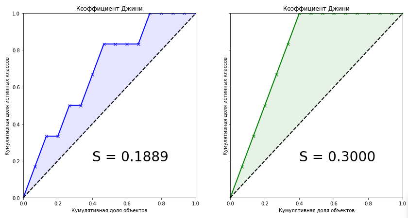
Коэффициент Джини для обученной модели равен 0.1889. Мало это или много? Насколько точен алгоритм? Без знания точного значения коэффициента для идеального алгоритма мы не можем сказать о нашей модели ничего. Поэтому метрикой качества в машинном обучении является нормализованный коэффициент Джини, который равен отношению коэффициента обученной модели к коэффициенту идеальной модели. Далее под термином «Коэффициент Джини» будем иметь ввиду именно это.

Глядя на эти два графика мы можем сделать следующие выводы:
- Предсказание идеального алгоритма является максимальным коэффициентом Джини для текущего набора данных и зависит только от истинного распределения классов в задаче.
- Площадь фигуры для идеального алгоритма равна:
- Предсказания обученных моделей не могут быть больше значения коэффициента идеального алгоритма.
- При равномерном распределении классов целевой переменной коэффициент Джини идеального алгоритма всегда будет равен 0.25
- Для идеального алгоритма форма фигуры, образуемой Lift Curve и и линией абсолютного равенства, всегда будет треугольником
- Коэффициент Джини случайного алгоритма равен 0, а Lift Curve совпадает с линией абсолютного равенства
- Коэффициент Джини обученного алгоритма будет всегда меньше коэффициента идеального алгоритма
- Значения нормализованного коэффициента Джини для обученного алгоритма находятся в интервале .
- Нормализованный коэффициент Джини является метрикой качества, которую необходимо максимизировать.

2. Алгебраическое представление. Доказательство линейной связи с AUC ROC
Мы подошли к самому, пожалуй, интересному моменту — алгебраическому представлению коэффициента Джини. Как рассчитать эту метрику? Она не равна своему родственнику из экономики. Известно, что коэффициент можно вычислить по следующей формуле:

Я честно пытался найти вывод этой формулы в интернете, но не нашел ничего. Даже в зарубежных книгах и научных статьях. Зато на некоторых сомнительных сайтах любителей статистики встречалась фраза: «Это настолько очевидно, что даже нечего обсуждать. Достаточно сравнить графики Lift Curve и ROC Curve, чтобы сразу всё стало понятно». Чуть позже, когда сам вывел формулу связи этих двух метрик, понял что эта фраза — отличный индикатор. Если вы её слышите или читаете, то очевидно только то, что автор фразы не имеет никакого понимания коэффициента Джини. Давайте взглянем на графики Lift Curve и ROC Curve для нашего примера:
Код на Python
from sklearn.metrics import roc_curve, roc_auc_score

aucroc = roc_auc_score(actual, predict)
gini = 2*roc_auc_score(actual, predict)-1
fpr, tpr, t = roc_curve(actual, predict)


fig, ax = plt.subplots(nrows=1,ncols=3, sharey=True, figsize=(15, 5))
fig.suptitle('Gini = 2 * AUCROC - 1 = {:0.2f}nn'.format(gini),fontsize = 18, fontweight='bold')
ax[0].plot([0]+fpr.tolist(), [0]+tpr.tolist(), lw = 2, color = 'red')
ax[0].fill_between([0]+fpr.tolist(), [0]+tpr.tolist(), color = 'red', alpha=0.1)
ax[0].text(0.4,0.2,'S = {:0.2f}'.format(aucroc),fontsize = 28)
ax[1].plot(x_values, y_values, lw = 2, color = 'blue')
ax[1].fill_between(x_values, x_values, y_values, color = 'blue', alpha=0.1)
ax[1].text(0.4,0.2,'S = {:0.2f}'.format(S_pred),fontsize = 28)
ax[2].plot(x_values, y_values_perfect, lw = 2, color = 'green')
ax[2].fill_between(x_values, x_values, y_values_perfect, color = 'green', alpha=0.1)
ax[2].text(0.4,0.2,'S = {:0.2f}'.format(S_actual),fontsize = 28)

ax[0].set(title='ROC-AUC', xlabel='False Positive Rate',
              ylabel='True Positive Rate', xlim=(0, 1), ylim=(0, 1))
for i in range(1,3):
    ax[i].plot([0,1],[0,1],linestyle = '--',lw = 2,color = 'black')
    ax[i].set(title='Коэффициент Джини', xlabel='Кумулятивная доля объектов',
              ylabel='Кумулятивная доля истинных классов', xlim=(0, 1), ylim=(0, 1))
plt.show();
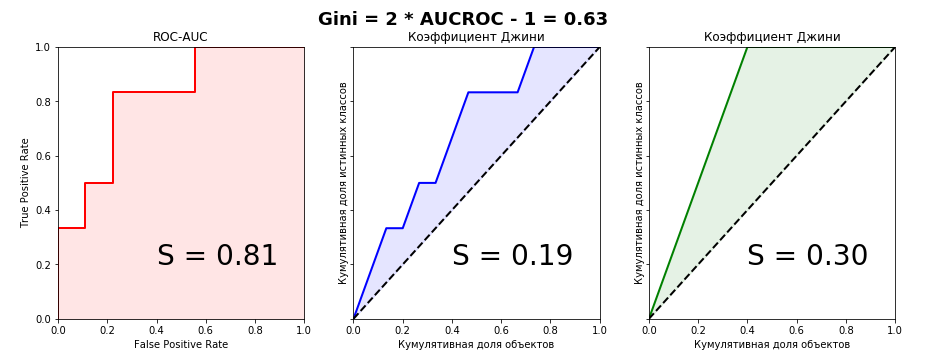
Прекрасно видно, что из графического представления метрик связь уловить невозможно, поэтому докажем равенство алгебраически. У меня получилось сделать это двумя способами — параметрически (интегралами) и непараметрически (через статистику Вилкоксона-Манна-Уитни). Второй способ значительно проще и без многоэтажных дробей с двойными интегралами, поэтому детально остановимся именно на нем. Для дальнейшего рассмотрения доказательств определимся с терминологией: кумулятивная доля истинных классов — это не что иное, как True Positive Rate. Кумулятивная доля объектов — это в свою очередь количество объектов в отранжированном ряду (при масштабировании на интервал
 — соответственно доля объектов).
Для понимания доказательства необходимо базовое понимание метрики ROC-AUC — что это вообще такое, как строится график и в каких осях. Рекомендую статью из блога Александра Дьяконова «AUC ROC (площадь под кривой ошибок)»
Введём следующие обозначения:
Параметрический метод
Параметрическое уравнение для ROC curve можно записать в следующем виде:

При построении графика Lift Curve по оси
 мы откладывали долю объектов (их количество) предварительно отсортированных по убыванию. Таким образом, параметрическое уравнение для Коэффициента Джини будет выглядеть следующим образом:

Подставив выражение (4) в выражение (1) для обеих моделей и преобразовав его, мы увидим, что в одну из частей можно будет подставить выражение (3), что в итоге даст нам красивую формулу нормализованного Джини (2)
Непараметрический метод
При доказательстве я опирался на элементарные постулаты Теории Вероятностей. Известно, что численно значение AUC ROC равно статистике Вилкоксона-Манна-Уитни:


где
 — ответ алгоритма на i-ом объекте из распределения «1»,
 — ответ алгоритма на j-ом объекте из распределения «0»
Доказательство этой формулы можно, например, найти здесь
Интерпретируется это очень интуитивно понятно: если случайным образом извлечь пару объектов, где первый объект будет из распределения «1», а второй из распределения «0», то вероятность того, что первый объект будет иметь предсказанное значение больше или равно, чем предсказанное значение второго объекта, равно значению AUC ROC. Комбинаторно несложно подсчитать, что количество пар таких объектов будет:
 .
.
Пусть модель прогнозирует
 возможных значений из множества
 , где
, где
 и
и
 — какое-то вероятностное распределение, элементы которого принимают значения на интервале
![$[0,1]$](https://habrastorage.org/getpro/habr/formulas/a5d/538/f83/a5d538f83bd73f9d1c9e8338db9a398a.svg) .
.
Пусть
 множество значений, которые принимают объекты
 и
и
 . Пусть
 множество значений, которые принимают объекты
 и
и
 . Очевидно, что множества
и
могут пересекаться.
Обозначим
 как вероятность того, что объект
примет значение
 , и
, и
 как вероятность того, что объект
примет значение
. Тогда
 и
и

Имея априорную вероятность
 для каждого объекта выборки, можем записать формулу, определяющую вероятность того, что объект примет значение
:

Зададим три функции распределения:
— для объектов класса «1»
— для объектов класса «0»
— для всех объектов выборки


Пример того, как могут выглядеть функции распределения для двух классов в задаче кредитного скоринга:
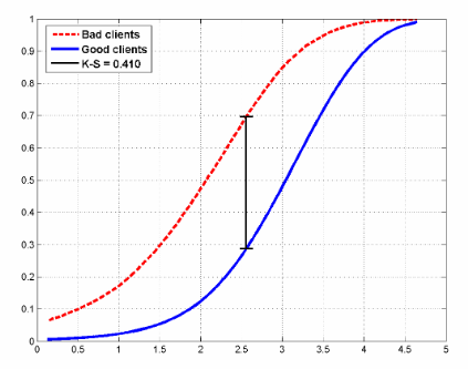
На рисунке также показана статистика Колмогорова-Смирнова, которая также применяется для оценки моделей.
Запишем формулу Вилкоксона в вероятностном виде и преобразуем её:

Аналогичную формулу можем выписать для площади под Lift Curve (помним, что она состоит из суммы двух площадей, одна из которых всегда равна 0.5):

И теперь преобразуем её:

Для идеальной модели формула запишется просто:

Следовательно из (8) и (9), получим:

Как говорили в школе, что и требовалось доказать.
3. Практическое применение
Как упоминалось в начале статьи, коэффициент Джини применяется для оценки моделей во многих сферах, в том числе в задачах банковского кредитования, страхования и целевом маркетинге. И этому есть вполне разумное объяснение. Эта статья не ставит перед собой целью подробно остановиться на практическом применении статистики в той или иной области. На эту тему написаны многие книги, мы лишь кратко пробежимся по этой теме.
Кредитный скоринг
По всему миру банки ежедневно получают тысячи заявок на выдачу кредита. Разумеется, необходимо как-то оценивать риски того, что клиент может просто-напросто не вернуть кредит, поэтому разрабатываются предиктивные модели, оценивающие по признаковому пространству вероятность того, что клиент не выплатит кредит, и эти модели в первую очередь надо как-то оценивать и, если модель удачная, то выбирать оптимальный порог (threshold) вероятности. Выбор оптимального порога определяется политикой банка. Задача анализа при подборе порога — минимизировать риск упущенной выгоды, связанной с отказом в выдаче кредита. Но чтобы выбирать порог, надо иметь качественную модель. Основные метрики качества в банковской сфере:
- Коэффициент Джини
- Статистика Колмогорова-Смирнова (вычисляется как максимальная разница между кумулятивными функциями распределения «плохих» и «хороших» заемщиков. Выше в статье приводился рисунок с распределениями и этой статистикой)
- Коэффициент дивергенции (представляет собой оценку разницы математических ожиданий распределений скоринговых баллов для «плохих» и «хороших» заемщиков, нормализованную дисперсиями этих распределений. Чем больше значение коэффициента дивергенции, тем лучше качество модели.)
Не знаю как обстоят дела в России, хоть и живу здесь, но в Европе наиболее широко применяется коэффициент Джини, в Северной Америке — статистика Колмогорова-Смирнова.
Страхование
В этой области всё аналогично банковской сфере, с той лишь разницей, что нам необходимо разделить клиентов на тех, кто подаст страховое требование и на тех, кто этого не сделает. Рассмотрим практический пример из этой области, в котором будет хорошо видна одна особенность Lift Curve — при сильно несбалансированных классах в целевой переменной кривая почти идеально совпадает с ROC-кривой.
Несколько месяцев назад на Kaggle проходило соревнование «Porto Seguro’s Safe Driver Prediction», в котором задачей было как раз прогнозирование «Insurance Claim» — подача страхового требования. И в котором я по собственной глупости упустил серебро, выбрав не тот сабмит.

Это было очень странное и в то же время невероятно познавательное соревнование. И с рекордным количеством участников — 5169. Победитель соревнования Michael Jahrer написал код только на C++/CUDA, и это вызывает восхищение и уважение.
Porto Seguro — бразильская компания, специализирующаяся в области автострахования.
Датасет состоял из 595207 строк в трейне, 892816 строк в тесте и 53 анонимизированных признаков. Соотношение классов в таргете — 3% и 97%. Напишем простенький бейзлайн, благо это делается в пару строк, и построим графики. Обратите внимание, кривые почти идеально совпадают, разница в площадях под Lift Curve и ROC Curve — 0.005.
Код на Python
from sklearn.model_selection import train_test_split
import xgboost as xgb
from scipy.interpolate import interp1d
from scipy.integrate import quad

df = pd.read_csv('train.csv', index_col='id')
unwanted = df.columns[df.columns.str.startswith('ps_calc_')]
df.drop(unwanted,inplace=True,axis=1)
df.fillna(-999, inplace=True)

train, test = train_test_split(df, stratify=df.target, test_size=0.25, random_state=1)
estimator = xgb.XGBClassifier(seed=1, n_jobs=-1)
estimator.fit(train.drop('target', axis=1), train.target)
pred = estimator.predict_proba(test.drop('target', axis=1))[:, 1]
test['predict'] = pred

actual = test.target.values
predict = test.predict.values

data = zip(actual, predict)
sorted_data = sorted(data, key=lambda d: d[1], reverse=True)
sorted_actual = [d[0] for d in sorted_data]

cumulative_actual = np.cumsum(sorted_actual) / sum(actual)
cumulative_index = np.arange(1, len(cumulative_actual)+1) / len(predict)
cumulative_actual_perfect = np.cumsum(sorted(actual, reverse=True)) / sum(actual)

aucroc = roc_auc_score(actual, predict)
gini = 2*roc_auc_score(actual, predict)-1
fpr, tpr, t = roc_curve(actual, predict)
x_values = [0] + list(cumulative_index)
y_values = [0] + list(cumulative_actual)
y_values_perfect = [0] + list(cumulative_actual_perfect)

fig, ax = plt.subplots(nrows=1,ncols=3, sharey=True, figsize=(18, 6))
fig.suptitle('Gini = {:0.3f}nn'.format(gini),fontsize = 26, fontweight='bold')

ax[0].plot([0]+fpr.tolist(), [0]+tpr.tolist(), lw=2, color = 'red')
ax[0].plot([0]+fpr.tolist(), [0]+tpr.tolist(), lw = 2, color = 'red')
ax[0].fill_between([0]+fpr.tolist(), [0]+tpr.tolist(), color = 'red', alpha=0.1)
ax[0].text(0.4,0.2,'S = {:0.3f}'.format(aucroc),fontsize = 28)
ax[1].plot(x_values, y_values, lw = 2, color = 'blue')
ax[1].fill_between(x_values, x_values, y_values, color = 'blue', alpha=0.1)
ax[1].text(0.4,0.2,'S = {:0.3f}'.format(S_pred),fontsize = 28)
ax[2].plot(x_values, y_values_perfect, lw = 2, color = 'green')
ax[2].fill_between(x_values, x_values, y_values_perfect, color = 'green', alpha=0.1)
ax[2].text(0.4,0.2,'S = {:0.3f}'.format(S_actual),fontsize = 28)

ax[0].set(title='ROC-AUC XGBoost Baseline', xlabel='False Positive Rate',
              ylabel='True Positive Rate', xlim=(0, 1), ylim=(0, 1))
ax[1].set(title='Gini XGBoost Baseline')
ax[2].set(title='Gini Perfect')
for i in range(1,3):
    ax[i].plot([0,1],[0,1],linestyle = '--',lw = 2,color = 'black')
    ax[i].set(xlabel='Share of clients', ylabel='True Positive Rate', xlim=(0, 1), ylim=(0, 1))
plt.show();
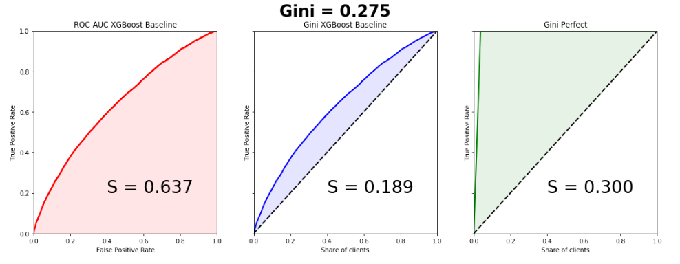
Коэффициент Джини победившей модели — 0.29698
Для меня до сих пор загадка, чего хотели добиться организаторы, занонимизировав признаки и сделав невероятную предобработку данных. Это одна из причин, почему все модели, в том числе и победившие, по сути получились мусорные. Наверное, просто пиар, раньше никто в мире не знал про Porto Seguro кроме бразильцев, теперь знают многие.
Целевой маркетинг
В этой области можно лучше всего понять истинный смысл коэффициента Джини и Lift Curve. Почти во всех книгах и статьях почему-то приводятся примеры с почтовыми маркетинговыми кампаниями, что на мой взгляд является анахронизмом. Создадим искусственную бизнес-задачу из сферы free2play игр. У нас есть база данных пользователей когда-то игравших в нашу игру и по каким-то причинам отвалившихся. Мы хотим их вернуть в наш игровой проект, для каждого пользователя у нас есть некое признаковое пространство (время в проекте, сколько он потратил, до какого уровня дошел и т.д.) на основе которого мы строим модель. Оцениваем модель коэффициентом Джини и строим Lift Curve:

Предположим, что в рамках маркетинговой кампании мы тем или иным способом устанавливаем контакт с пользователем (email, соцсети), цена контакта с одним пользователем — 2 рубля. Мы знаем, что Lifetime Value составляет 5 рублей. Необходимо оптимизировать эффективность маркетинговой кампании. Предположим, что всего в выборке 100 пользователей, из которых 30 вернется. Таким образом, если мы установим контакт со 100% пользователей, то потратим на маркетинговую кампанию 200 рублей и получим доход 150 рублей. Это провал кампании. Рассмотрим график Lift Curve. Видно, что при контакте с 50% пользователей, мы контактируем с 90% пользователей, которые вернутся. затраты на кампанию — 100 рублей, доход 135. Мы в плюсе. Таким образом, Lift Curve позволяет нам наилучшим образом оптимизировать нашу маркетинговую компанию.
4. Сортировка пузырьком
Коэффициент Джини имеет довольно забавную, но весьма полезную интерпретацию, с помощью которой мы его также можем легко подсчитать. Оказывается, численно он равен:

где,
 число перестановок, которые необходимо сделать в отранжированном списке для того, чтобы получить истинный список целевой переменной,
 — число перестановок для предсказаний случайного алгоритма. Напишем элементарную сортировку пузырьком и покажем это:
Код на Python
actual = [1, 1, 1, 1, 1, 1, 0, 0, 0, 0, 0, 0, 0, 0, 0]
predict = [0.9, 0.3, 0.8, 0.75, 0.65, 0.6, 0.78, 0.7, 0.05, 0.4, 0.4, 0.05, 0.5, 0.1, 0.1]

data = zip(actual, predict)
sorted_data = sorted(data, key=lambda d: d[1], reverse=False)
sorted_actual = [d[0] for d in sorted_data]
swaps=0
n = len(sorted_actual)
array = sorted_actual

for i in range(1,n):
    flag = 0
    for j in range(n-i):
        if array[j]>array[j+1]:
            array[j], array[j+1] = array[j+1], array[j]
            flag = 1
            swaps+=1
    if flag == 0: break

print("Число перестановок: ", swaps)
Число перестановок: 10
Комбинаторно несложно подсчитать число перестановок для случайного алгоритма:

Таким образом:

Видим, что мы получили значение коэффициента, как и в рассматриваемом выше игрушечном примере.
Надеюсь, статья была полезна и развеяла некоторые мифы относительно этой метрики качества.